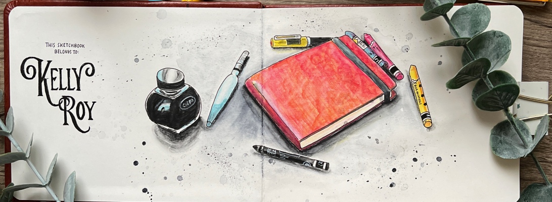
Originals of my art are available for purchase at my shop. Here’s what’s currently available.
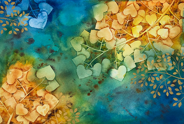
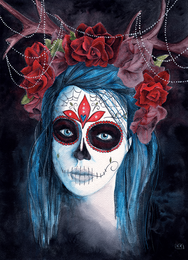
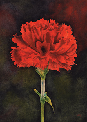
Optionally, if you would like prints, remember to visit my Redbubble shop.

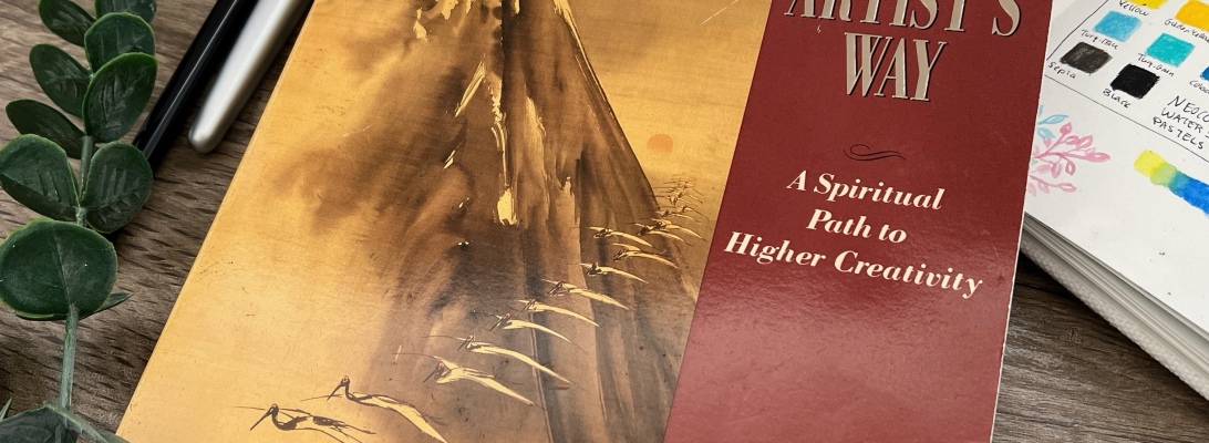
Over the last three months, I decided to finally pick up, read, and participate in Julia Cameron’s “The Artist’s Way.” A book I’m sure quite a bit of you have heard of over the years.
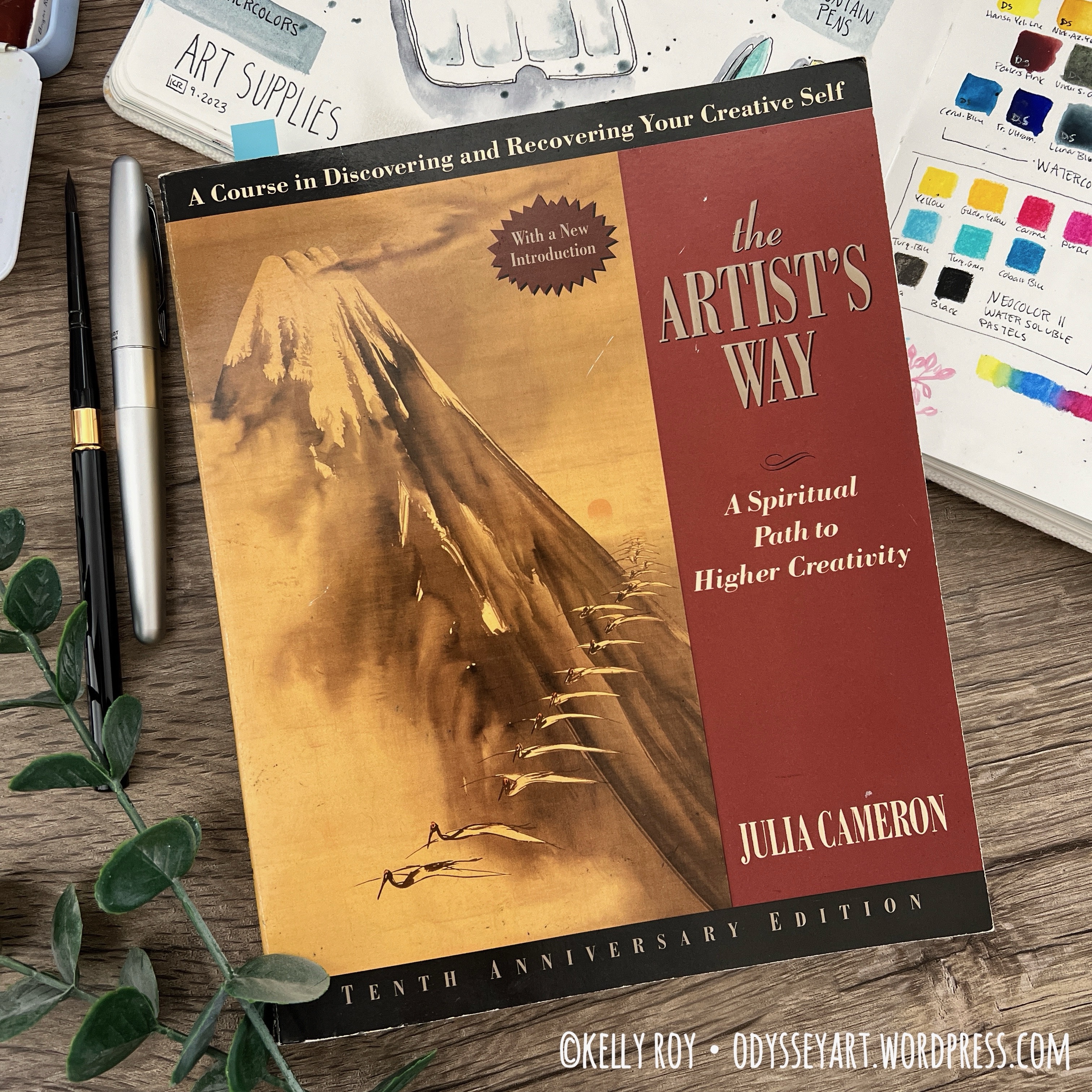
For some reason, this book has been hitting a new kind of popularity out in the social media-verse. I’ve seen lots of YouTubers talking about doing it or thinking of doing it, etc. After seeing a few of these experiences shared, I remembered I had my own copy of “The Artist’s Way” sitting on my bookshelf. Long forgotten and gathering dust.
I first picked this book up 16 years ago. Good grief, it’s crazy even saying it’s been that long, knowing all that has come to pass during that time frame. A divorce, a move, a new job, and my diving into living a more creative life.
The first time I started “The Artist’s Way”, I only got about three weeks in, then I stopped. For good reason. My life got turned upside down by my ex-husband’s alcoholism. I don’t talk much about my personal life on here, since, really, this is supposed to be an art blog, not an autobiographical accounting of my life.
But after having made it all the way through “The Artist’s Way” this time, 16 years later, I’ve found there’s no arguing that our creative lives are deeply intertwined with our personal lives. We’re human beings, after all. Not robots.
16 years ago, there just was no way I was in any sort of a place to work with “The Artist’s Way”. I was grappling with how to survive around active alcoholism in my life. In hind sight, I feel like my Higher Power was watching out for me and said “No… I’ve got a different path for you right now. We’ll come back to ‘The Artist’s Way’ later.”
I think the timing ended up being just right, because through those years with the alcoholic and eventual divorce from him, I found myself a support network that guided me to find and define a God of my understanding that I could trust and to whom I could give over the care of my life.
That Julia Cameron references 12-step recovery often in the pages of “The Artist’s Way” is quite convenient. I found it easy to entertain her gentle nudges to put my creativity into the hands of a power greater than myself.
In short, the “woo-woo-ness” of this book that many people often complain about didn’t bother me at all. I’m comfortable with my spirituality, and have come a long way from having my hackles rise anytime someone mentions the “G” “O” “D” word around me.
Believe me, I was very adverse to discussions about God in the past, immediately dreading that someone was going to tell me I was going to go to hell because I’m a terrible sinner at my core. This shaming would then immediately be followed up with an announcement that I could find salvation so long as I joined this person’s religion. There’s no faster way to turn me off from something than to tell me I’m a horrible person at my core.
I confirm, there is plenty of discussion about “God” in this book. But then, what should you expect when you pick up a book with a subtitle that says “A Spiritual Path to Higher Creativity”?
Julia does not threaten you with damnation, however. She doesn’t tell you her understanding of God is what you should believe. She gently guides you to define what your own Higher Power is supposed to be. And for many of us, that Higher Power isn’t some jealous, vindicitve deity up in the sky. It could be the power of the universe, nature, love, etc. And absolutely, that Higher Power can instead be loving and supportive.
I can honestly say that this book managed to add to my ever-evolving relationship with God, and in good ways. That was an appreciated, unexpected perk.
So now having had this experience of working all the way through this book, I just wanted to touch on a couple common misconceptions about this book.
Often when you see people’s reviews about doing “The Artist’s Way” they magnetize to and get stuck on talking about doing the Morning Pages and the (oft-dreaded) Artist’s Dates.
This 12-week course is way, way more than just writing three pages in your notebook every morning and fretting about what your next Artist’s Date is supposed to be. People tend to hint that those exercises are the true work in the book, but I disagree.
Each week, Julia dives into further and further descriptions, details, and exercises that help you look at yourself and your creativity as a whole, rather than as a separate part of you.
There are many, many more exercises in the book beyond the Morning Pages and Artist’s Dates, where you are encouraged to dive really deep into what makes you tick and what subconscious things, people, behaviors, etc. keep you shying away from spending time being creative.
If you think you can skip all the reading and just dive into doing Morning Pages and Artist’s Dates and reap the benefits of the book that way, you’ll be missing out on a lot.
I blocked out out entire Sunday mornings to dedicate to reading the start of each week’s chapter, and took the time to answer her many questions and participate in her detective work and other suggested exercises throughout the weeks.
One surprising exercise from Week 2 was to list 10 simple changes I’d like to make for myself. (Bonus is that some of these things can absolutely become a future Artist’s Date.) I wrote some things down like “declutter”, “rearrange my bedroom”, and “honor my commitment to have lunch with my parents.” At the end of that list, she tells you to pick one item and do it. Well, ta-da – I had lunch with my parents. And finally, not long after finishing the book, I also got around to rearranging my bedroom.
This book really is about taking action. Tosha Silver writes a suggestion to her readers in her wonderful book “It’s not Your Money”. I’m paraphrasing here, since I have it on Audiobook and it’s difficult to pinpoint the chapters that way, but she says something along the lines that her book is about taking action. Sure, you can choose to just read it and be like a group of people safely sitting on the sidelines, sunning themselves on the side of a riverbank. But you’ll get more out if it if you take action, dive in, and frolic in the cool waters.
I’m looking for positive change in my life, always, and I recognize I need to do the footwork. I can’t just sit back and expect the universe to do everything for me. God, the Creator, the Universe, whatever you want to call it/her/him desires participation. I read a funny quip in another piece of literature not long ago where someone complimented a person on their garden, saying “Wow, God has done such wonderful work on your garden!” The gardener retorted “Really? You should see what it looks like if I only leave it up to God.”
I’m looking to participate in my life, and that means doing all the exercises in “The Artist’s Way”, beyond the Morning Pages and Artists’s Dates. Those are critical, too, but not the backbone of the book, in my humble opinion. If you want to get everything out of what the book has to offer, don’t think you can shortcut it by only doing the writing and taking little field trips.
Get brave and read her essays in relation to the additional work she asks you to do. Sit down and write your answers to the difficult questions. One of my favorites is “what’s your favorite creative block” from Week 4. Yes, we have “favorite” negative behaviors. (For me, that block is sitting and watching television or YouTube for far too many hours of my day. It’s a small wonder that I end each day wondering where the day went and why I feel like I never have any time to take care of important things.)
Did I become creatively unblocked? I’m not so sure about that. But then I’m an artist and practice art a lot of the time, and to be honest, a lot of the discussion in this book seems geared a little bit more towards people who pretty much never practice art for all the reasons she lists: “it’s unpractical”, “there’s no time”, “I’m not good enough”, etc.
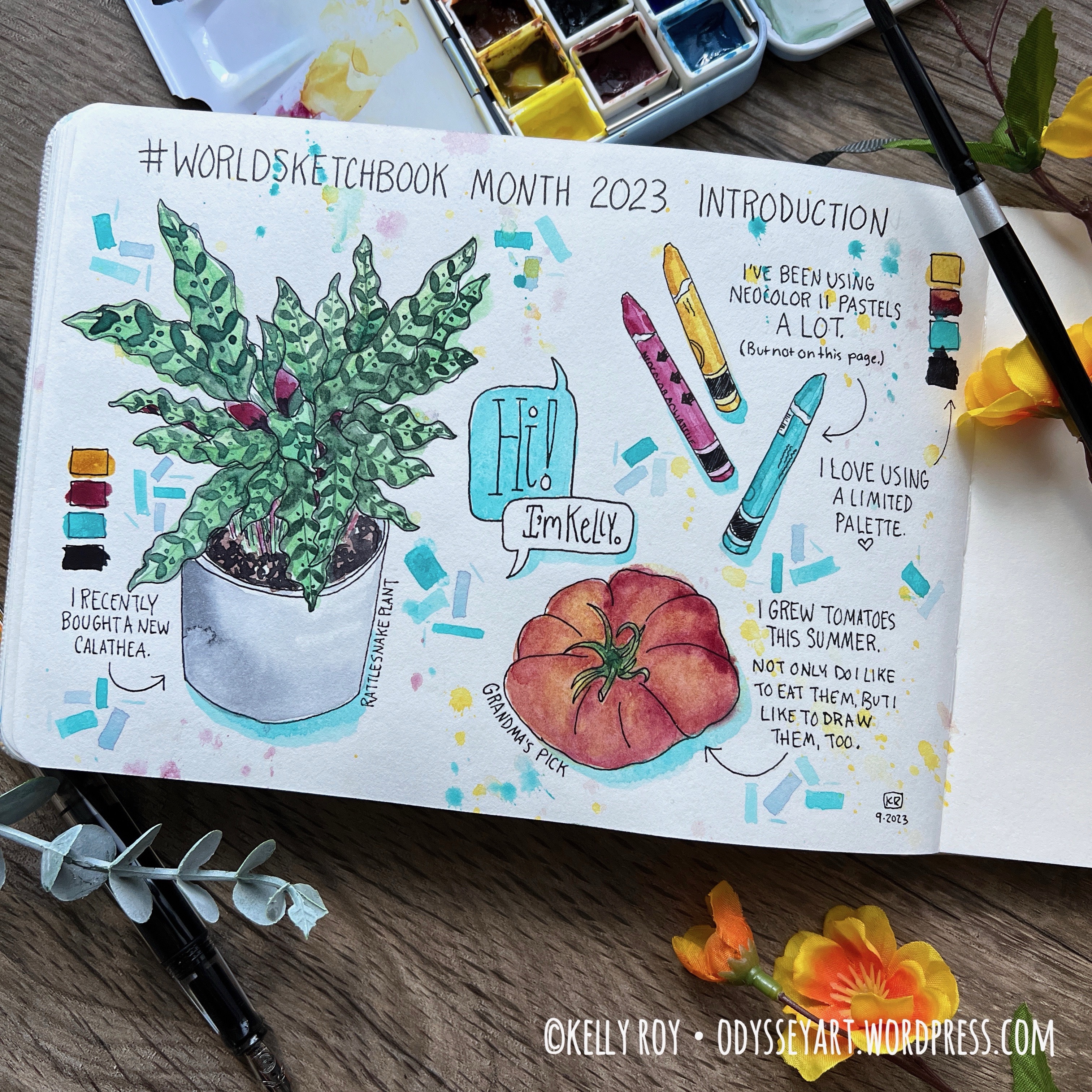
I did manage to squeeze in a few illustrations and paintings while actively working through the book. I even shifted gears and made some Coptic stitch sketchbooks for a change of pace. Part of what kept me going there, however, was hosting and participating in World Sketchbook Month. I honestly may have done less were it not for WSBM.


That said, I still felt a bit on the uninspired side, and maybe that’s really only because I just needed to give myself a bit of a break from constantly creating for probably the last nine or so months.
What I DID get out of this book were some valuable exercises on coming back to myself and giving myself the attention I need and deserve. This book guided me towards becoming more available to myself, not just emotionally, but also in just quality time spent with myself.
The Morning Pages and Artist’s Dates help with this, as well as a lot of her other weekly tasks she assigns at the end of each chapter. Identifying areas where we continually block ourselves, toxic relationships, etc.
This book is much more than just “get out a sketchbook and draw” or “sit down and write a new chapter every day”. In fact, it seems she spends little time on pressuring us to actually do specific creative exercises, but instead encourages us to be kinder and gentler to ourselves and clear out the obstacles we have in our lives that prevent us from pursuing our creative dreams.
I’m glad I finally picked this book up and gave it my full attention and participation. I do feel like I’ve grown in positive ways and that I’m a different person now than I was 12 weeks earlier.
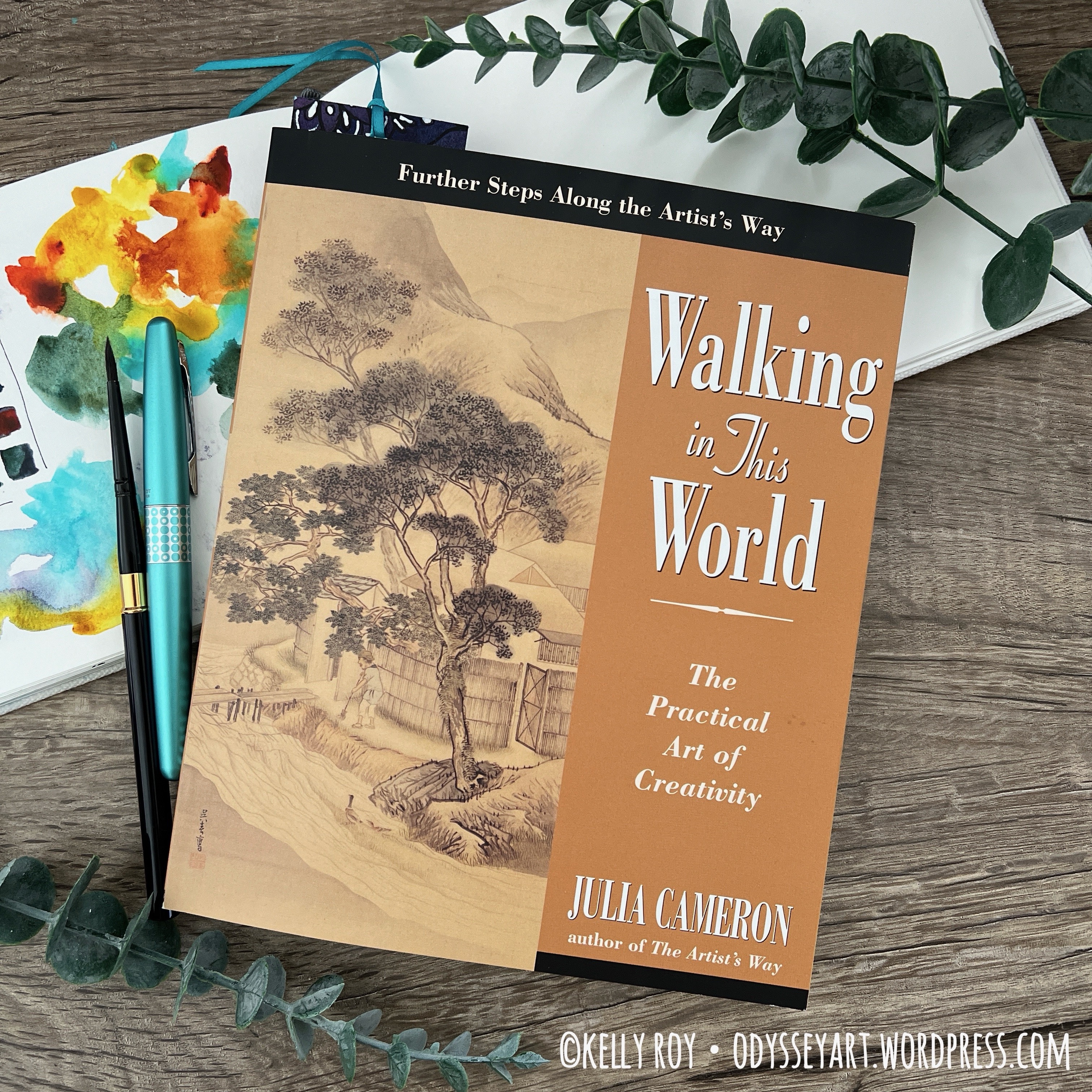
I enjoyed the book and the exercises so much, I picked up her second book “Walking in this World” to continue the journey. I’m someone who seems to always require a project to be working on/towards. I’m looking forward to discovering more and more about myself and this beautiful world, and taking part in more purposeful activities that encourage me to take good care of myself, and, in the long run, support my creativity.
Have you read and done the work in “The Artist’s Way”? How long ago? Have you gone through it multiple times? What did you get out of it? Or have you heard of it but not been interested?
Share your experience in the comments below.
Thanks for dropping by and taking a few moments to read about this experience. I hope it clears up some misconceptions about this book and you feel encouraged to give it a try yourself. Who knows what will come up for you?
Contains affiliate links. See disclosure for more info.
“The Artist’s Way” by Julia Cameron
“Walking in this World” by Julia Cameron
“It’s Not Your Money” by Tosha Silver
As an Amazon Associate I earn from qualifying purchases. A list of materials can be found at the end of this post. As usual, please note that any links to Amazon products within this post are affiliate links, meaning I make a minute commission should you choose to purchase something via the link. This is at no additional cost to you. That said, I appreciate your patronage by using the links to purchase products. While small, any amount of money helps me to keep making art and sharing it with the world.
Hello again, those of you reading my blog. Were you wondering if I disappeared? I kind of did for a while. My creativity has really slowed down, just about to a crawl or a trickle. It’s been an interesting summer where my artwork is concerned. I still haven’t been feeling much inspiration, at least not enough where I’ve been hurrying to grab my sketchbook and draw or paint on a regular basis.
I’m not quite sure what that’s all about. Maybe it’s physiological hormonal stuff. Maybe it’s stress, maybe it’s adjusting to some changes I made earlier in the year. Not sure. But I can say I haven’t lacked for trying. I even just recently finished reading “The Artist’s Way” by Julia Cameron to help me get my creative muse back. (I’ll post about that experience on another day.)
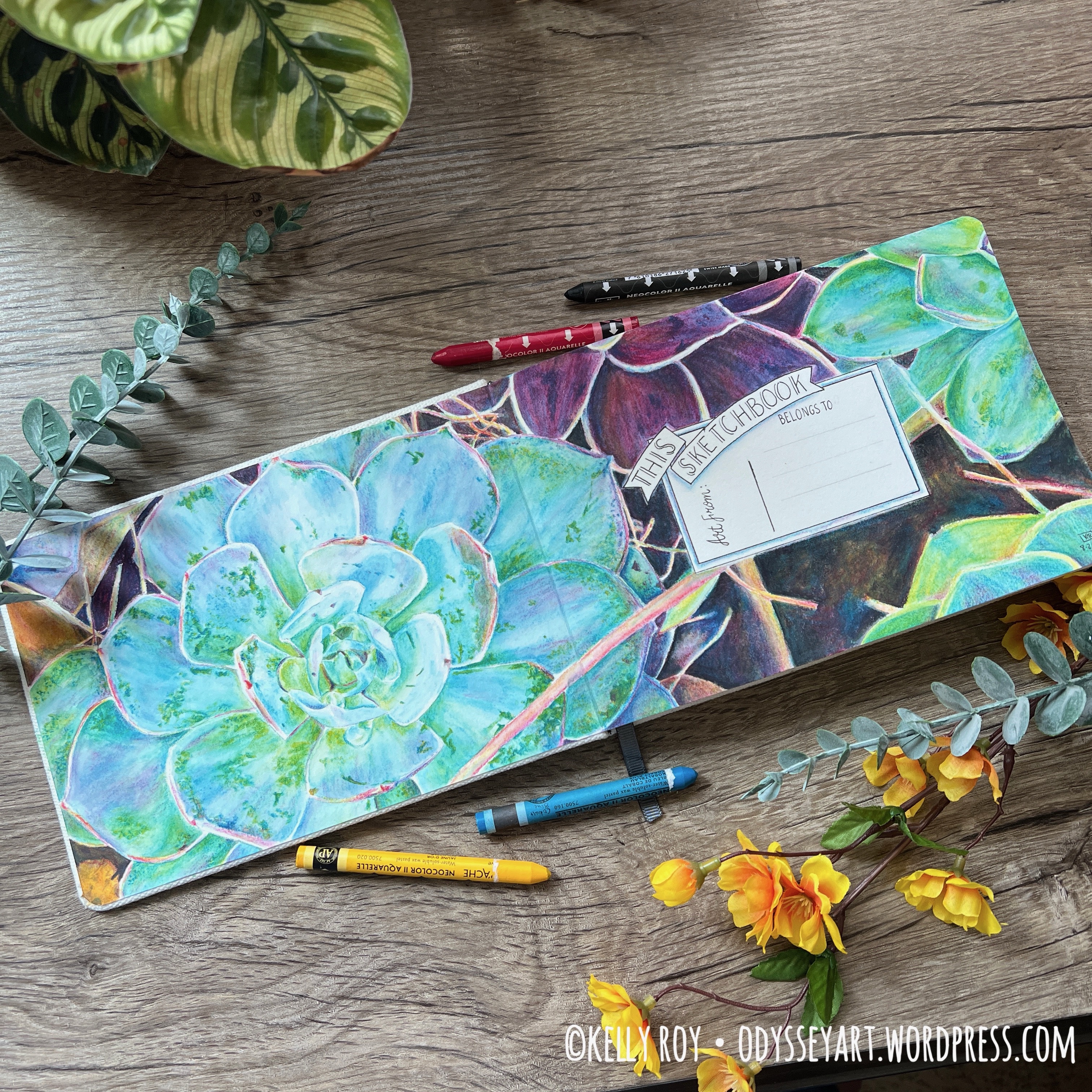
Bright side is, I’m up to four completed sketchbooks this year. Much better than just one or none. This particular sketchbook was one I started working in a couple of years ago, back in September of 2021. It was before I was used to working in hot press sketchbooks, so it ended up taking a back seat for quite a while until I decided to put my head down this year and finish filling it.
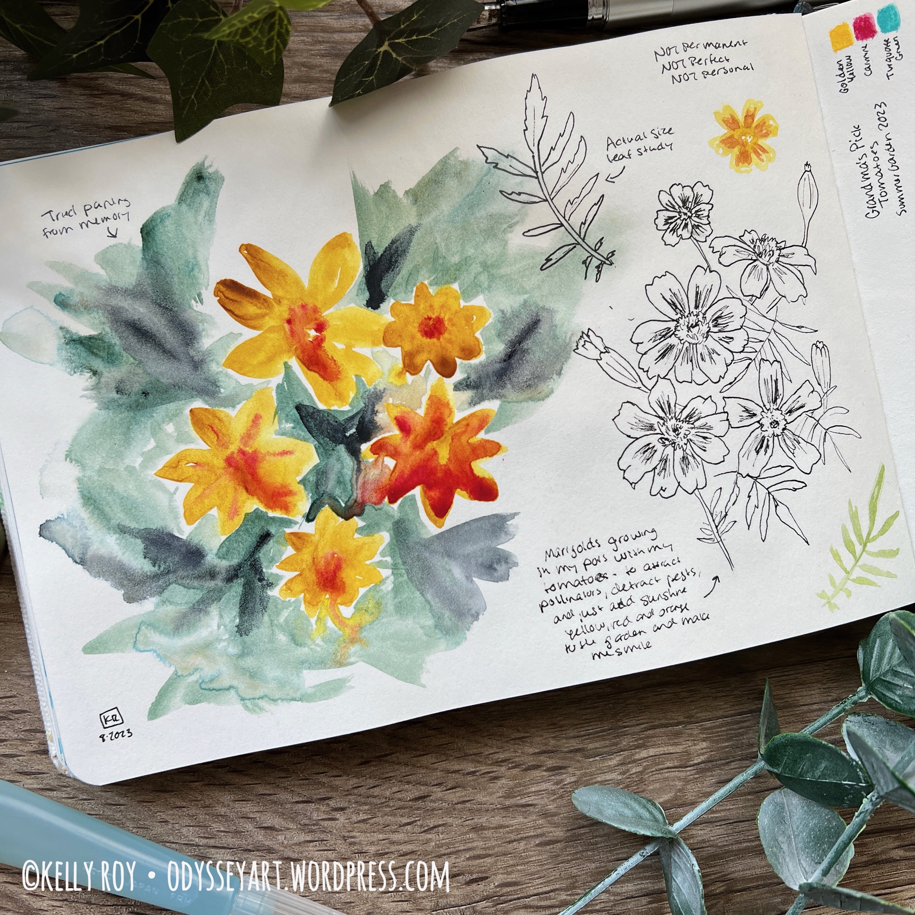
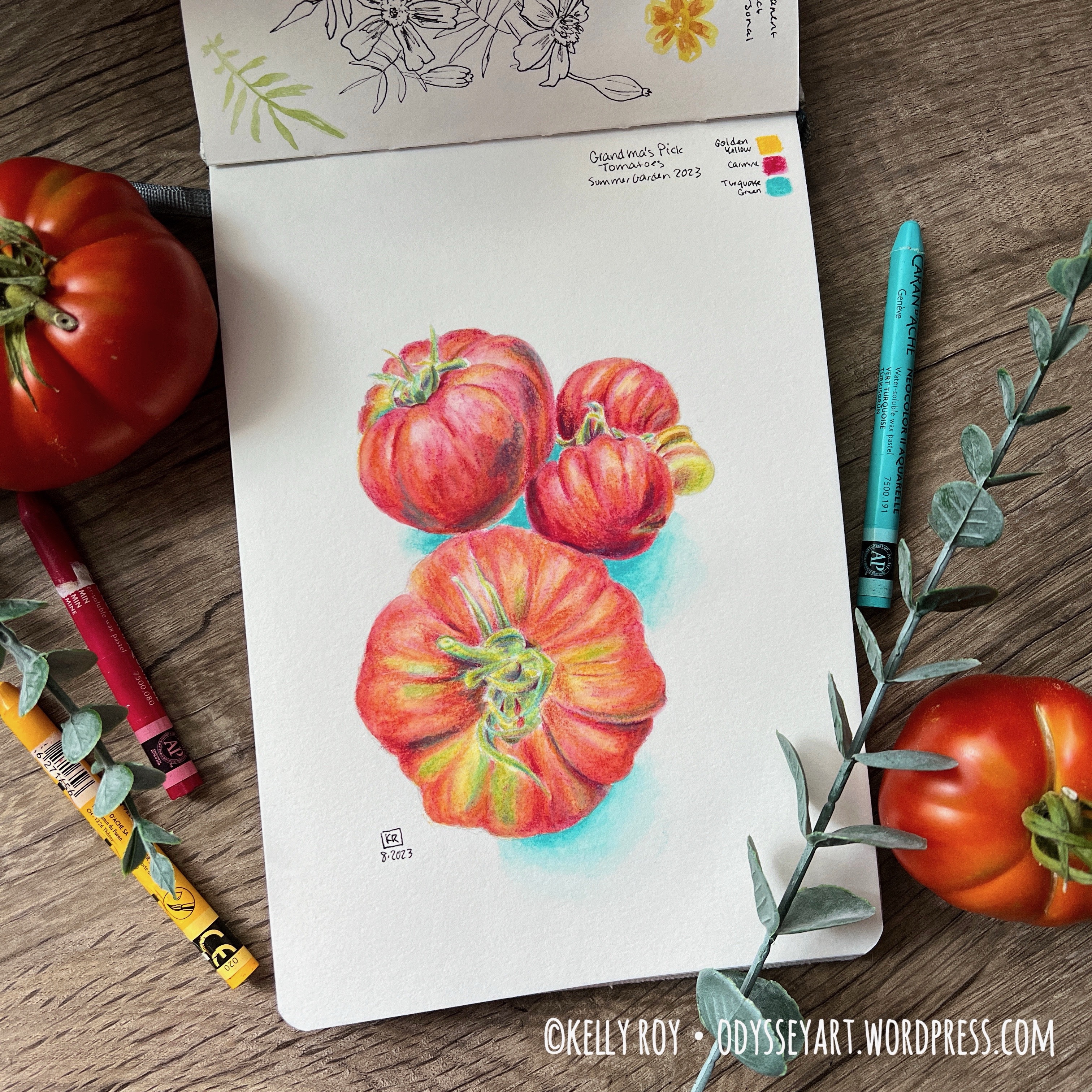
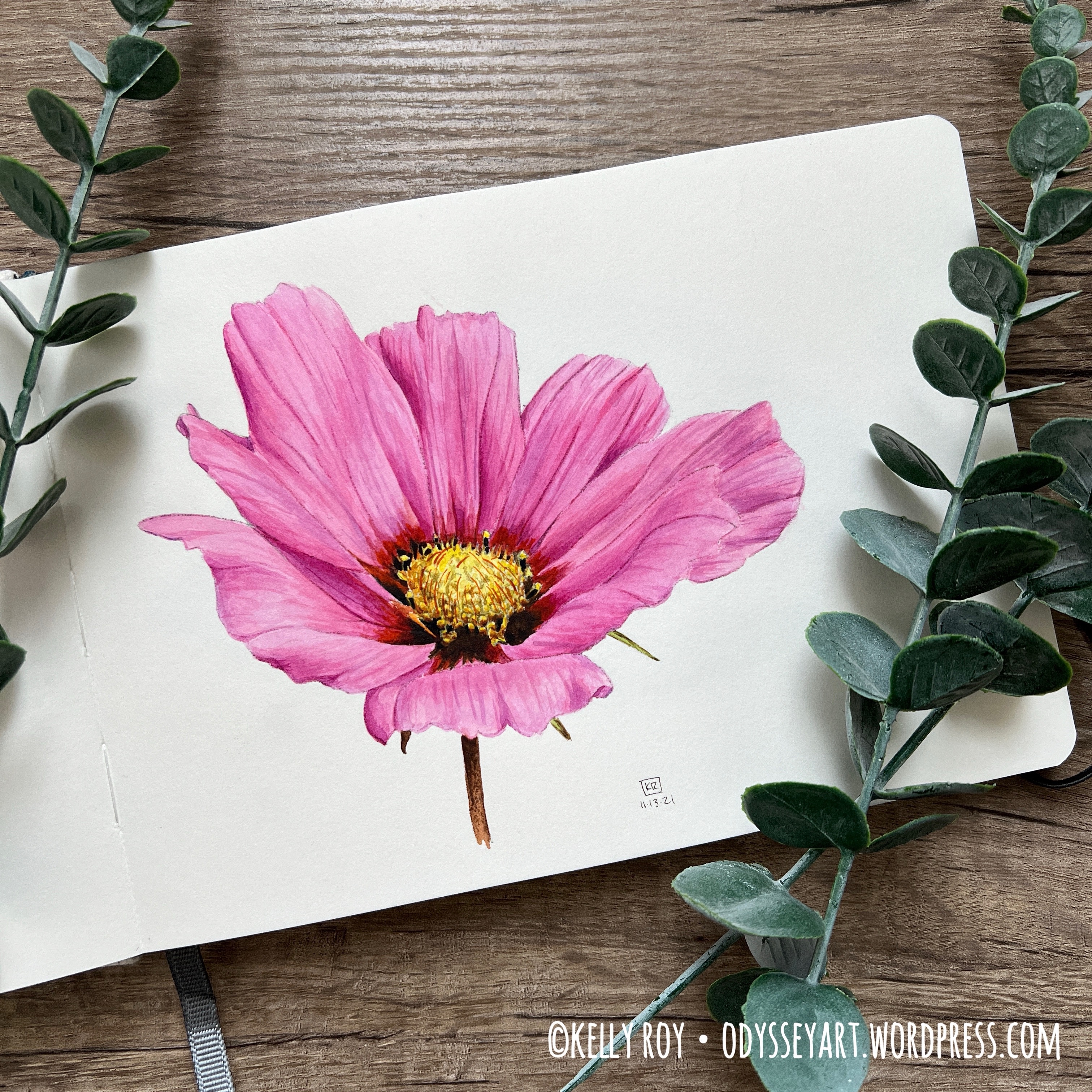
As usual, you’ll see a wide variety of subjects and styles in this sketchbook. Towards the beginning of filling this sketchbook, I was using it for some botanical artwork tutorials from Anna Mason. If the pear and the pink cosmos flower look familiar to you, it’s because they’re some of Anna Mason’s more popular tutorials.
Those were really interesting to do as they forced me to approach watercolor in a completely different way than what I usually do. I almost would equate it to using watercolor like colored pencils because you’re using teeny-tiny brushes and laying down color wet on dry in small little strokes. Really interesting stuff for sure. I still want to do some more of her tutorials, and they’re best done on hot press paper.
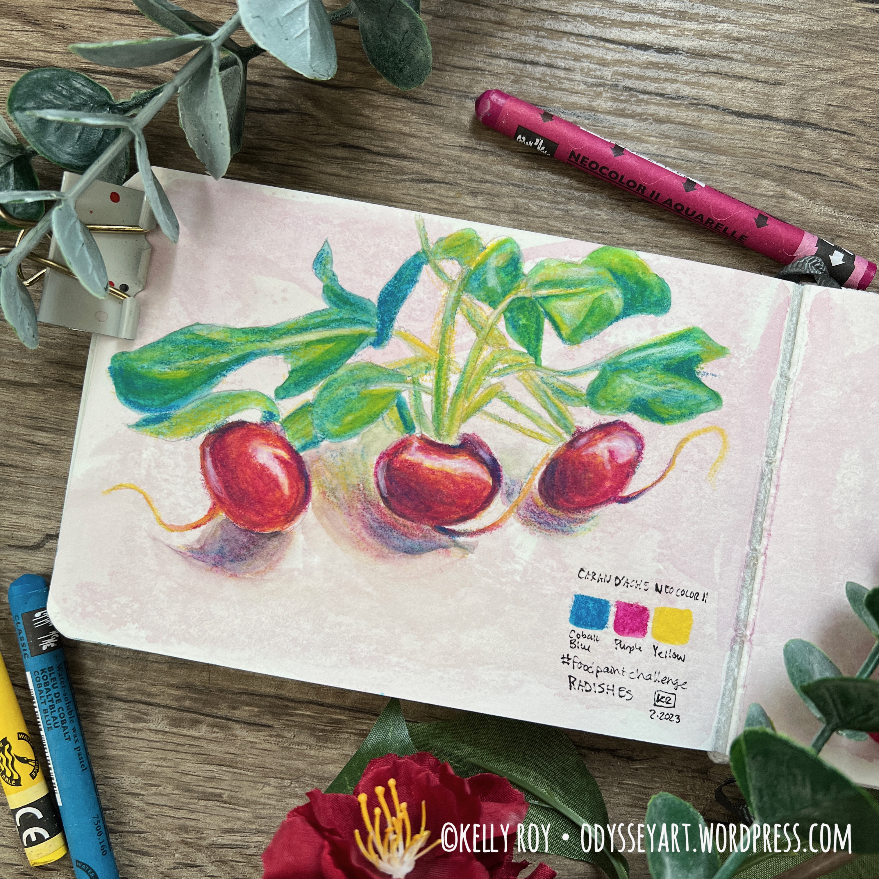
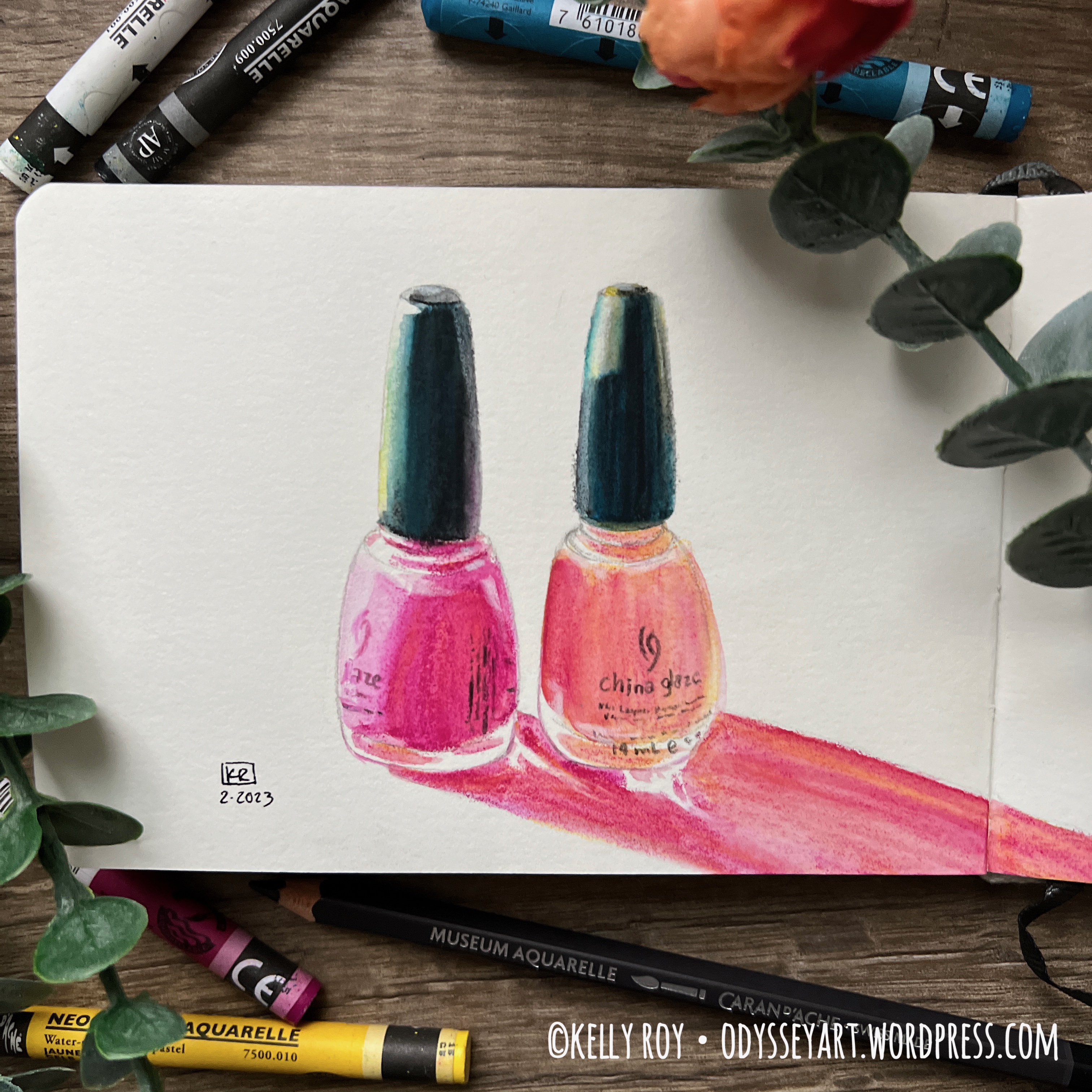
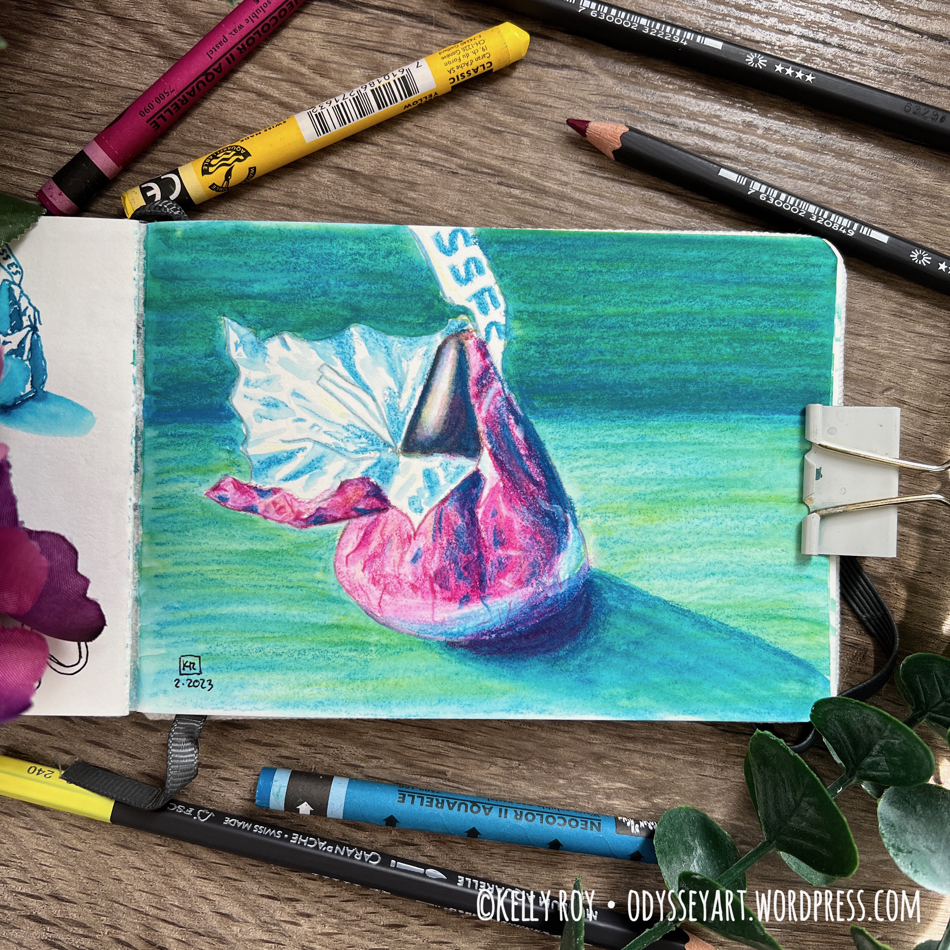
Through the rest of the book you’ll see some #foodpaintchallenge entries, general scribbles with ink and watercolor, and more play with Caran d’Ache Neocolor II pastels. There’s also some work in there with Caran d’Ache Museum Aquarelle watercolor colored pencils. I have to say, between the two, I prefer the pastels since their color payload is significantly richer than the watercolor colored pencils.
I also attempted to do a little bit of watercolor-only works in the sketchbook, mostly for the purpose of painting on hot press paper (not just illustrating on it or using water-soluble media on it.)
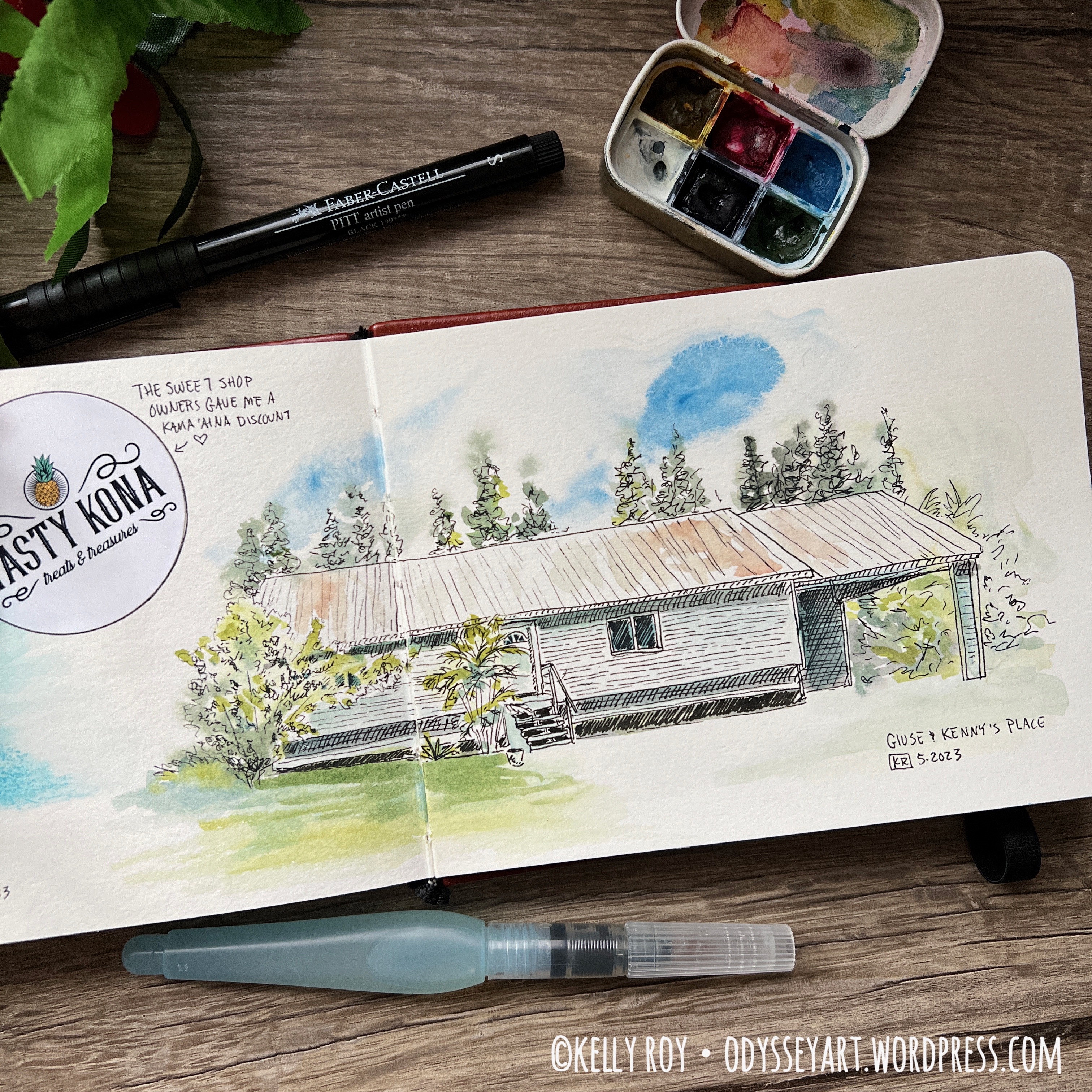
I managed to take the sketchbook with me on a weekend trip in the mountains around the beginning of October and sat down and did a quick on-site ink sketch of the landscape. Oh, and I took it for a little urban sketching adventure back in September to Union Station in Denver. So it’s been on a couple adventures with me, including a trip to the library and around the neighborhood, too.
Surprisingly I don’t have many leaf/autumn-inspired artworks in this sketchbook from this fall. And we had a gorgeous fall here in Colorado. It was mild, beautiful weather all through October, allowing for the trees to display all their colorful leaves in their full glory before the first snow, which only happened here just a couple days before Halloween.
This was an Etchr sketchbook. If you’re curious about the sketchbook, I posted a review about working in them a while back on my blog.
For my next sketchbook, I’m actually working in a custom made coptic stitch sketchbook that I made myself a couple months ago using Fluid 100% cotton hot press paper. I’m excited to be working in a sketchbook made by my own hands for once. It’s been a long time since I did that. The Fluid brand paper is new to me, so we’ll see what I think of working on it. So far it seems pretty nice, but I’m only about two pages in.
I still haven’t done much exploring recently to see if there are possibly any other new and exciting 100% cotton watercolor sketchbook brands out there. If you come across one, by all means, leave me a comment as I’d love to check it out. For now, I’ll just focus on working in my custom coptic stitch sketchbook.
Not much has changed for cold press watercolor sketchbooks that I’m working in. I’m still slowly making my way through an A5 Etchr Perfect Sketchbook and my Koval Sketchilla Sketchbook.
That’s enough from me. Grab yourself some coffee or tea and enjoy the quick flip-through below. I’ve also included some photos of some of my favorite pieces from this sketchbook below the video embed.
And remember, if you see any paintings you like, check my Redbubble shop as I’ve been uploading prints from this sketchbook there for sale.
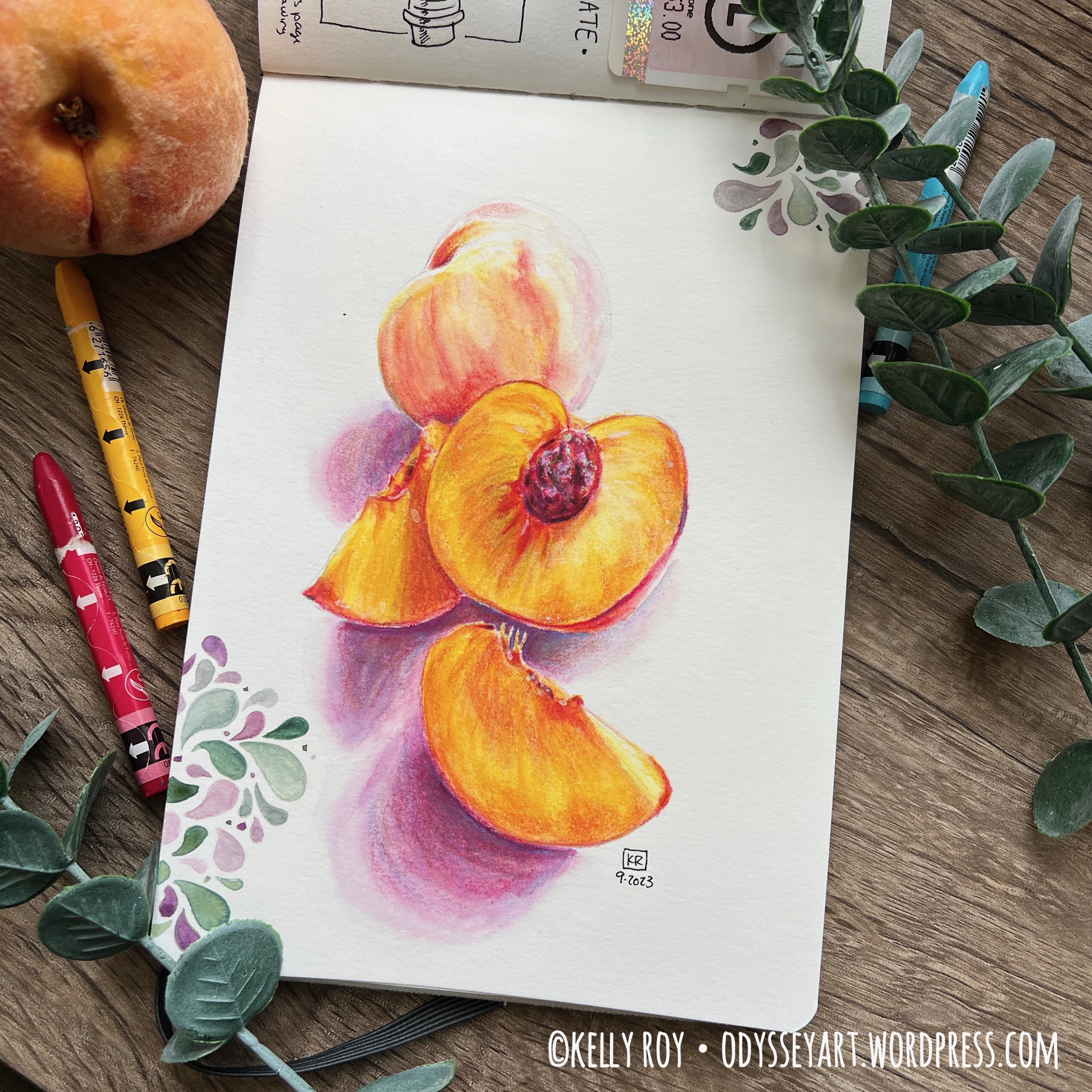
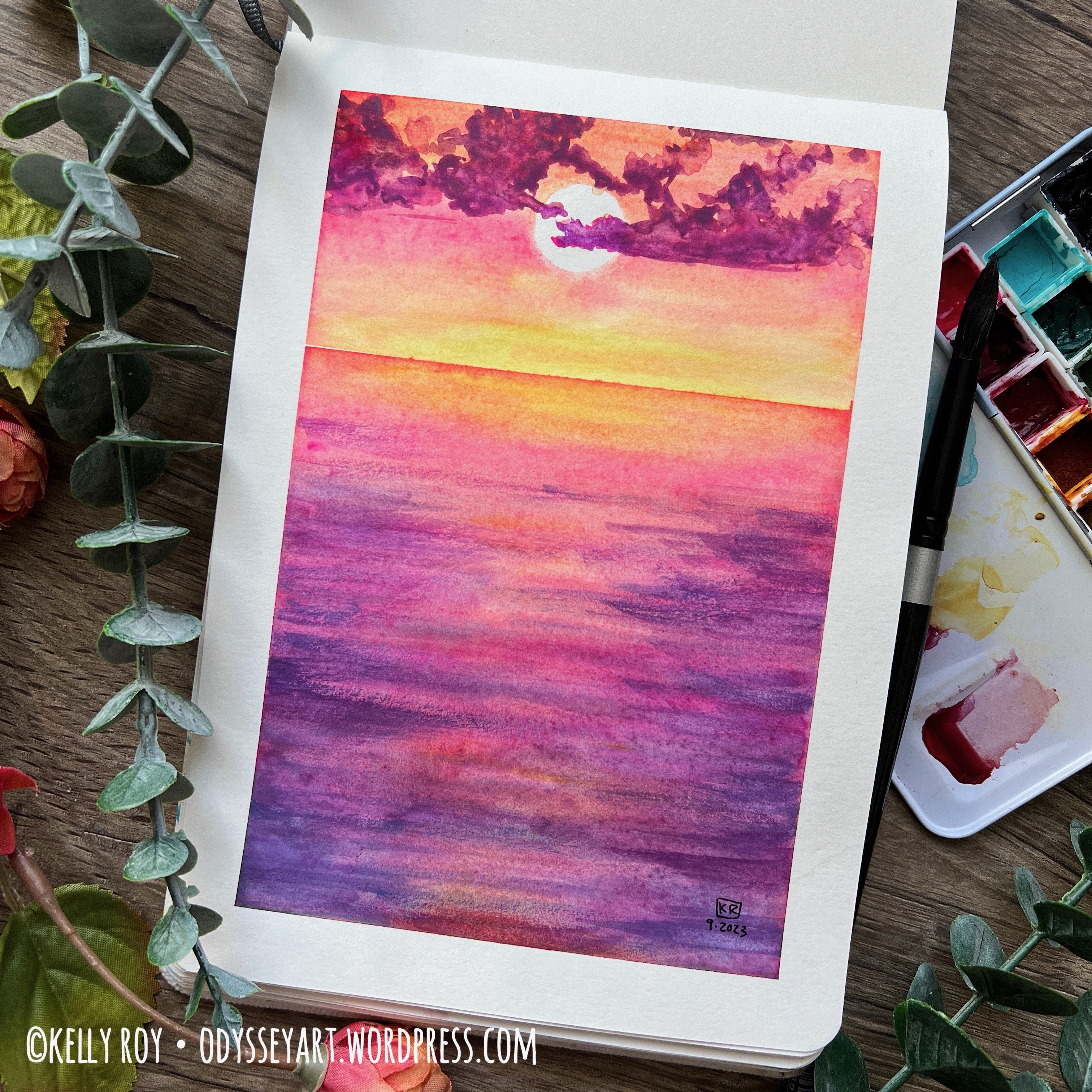
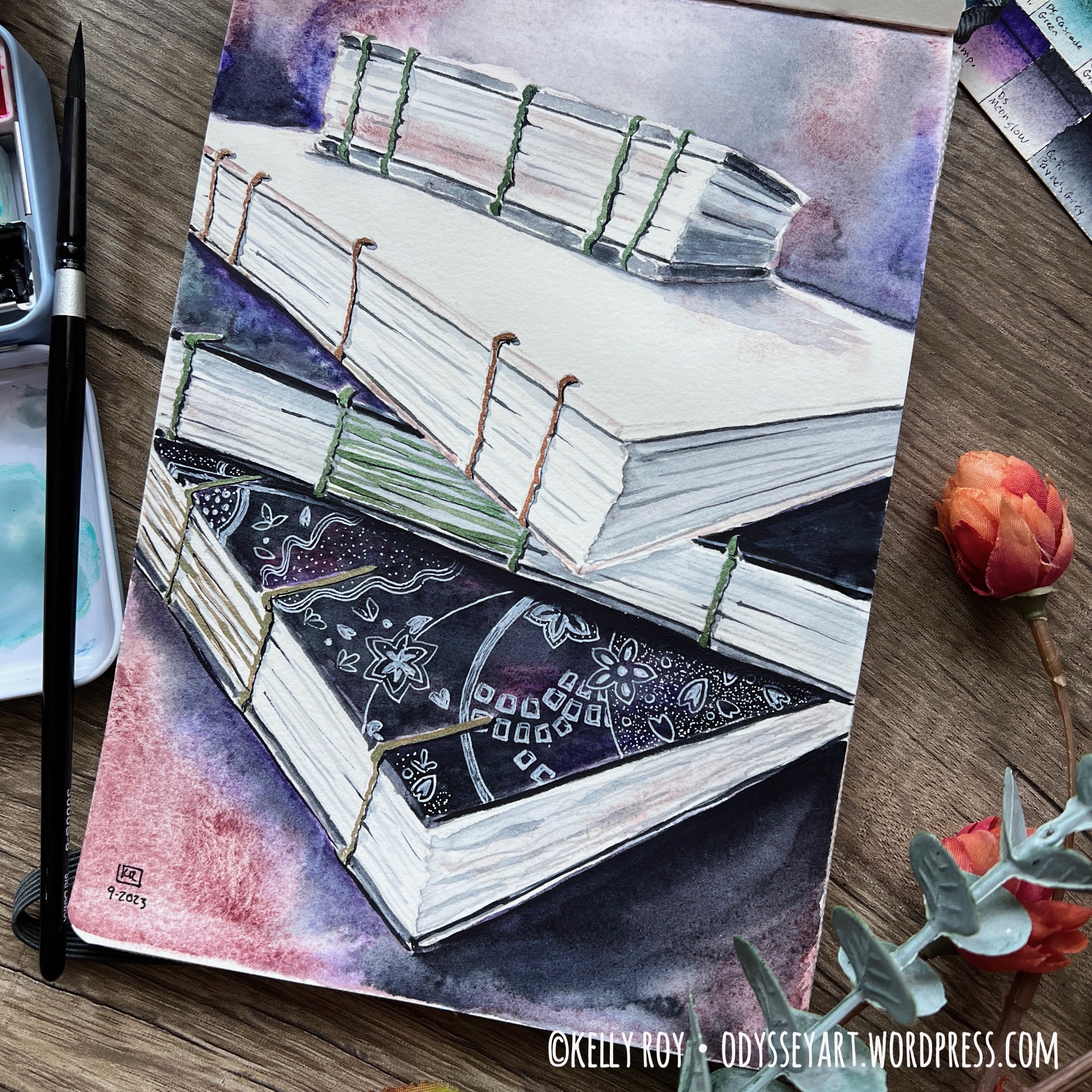
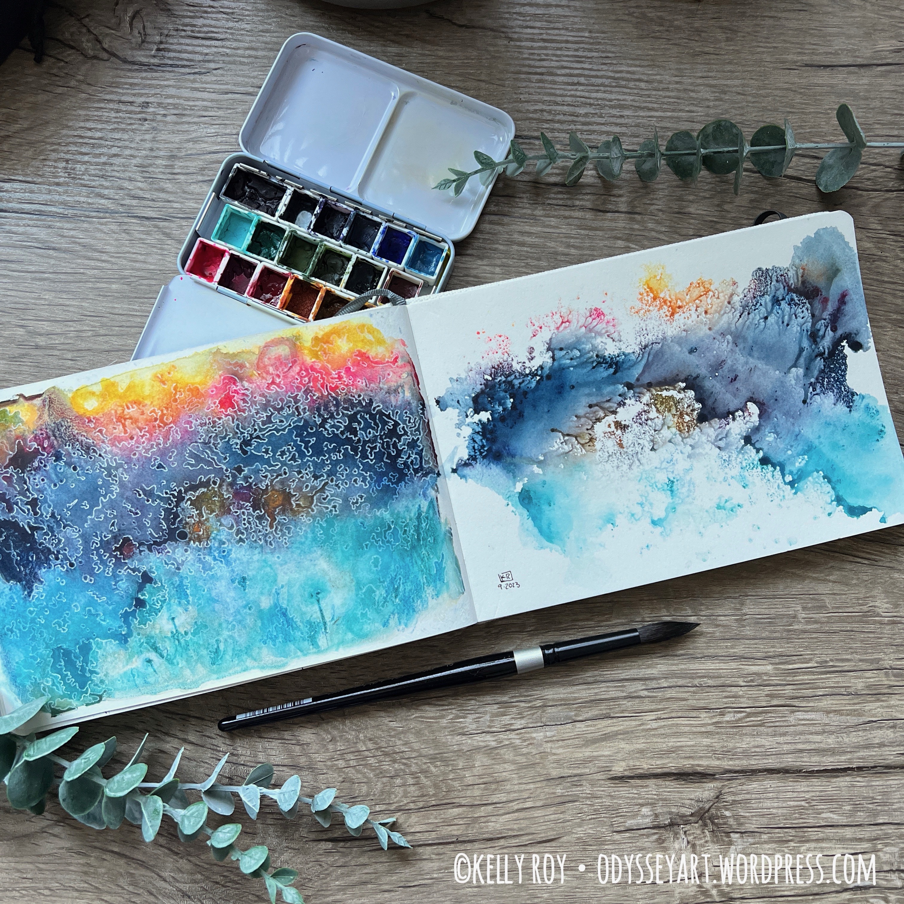
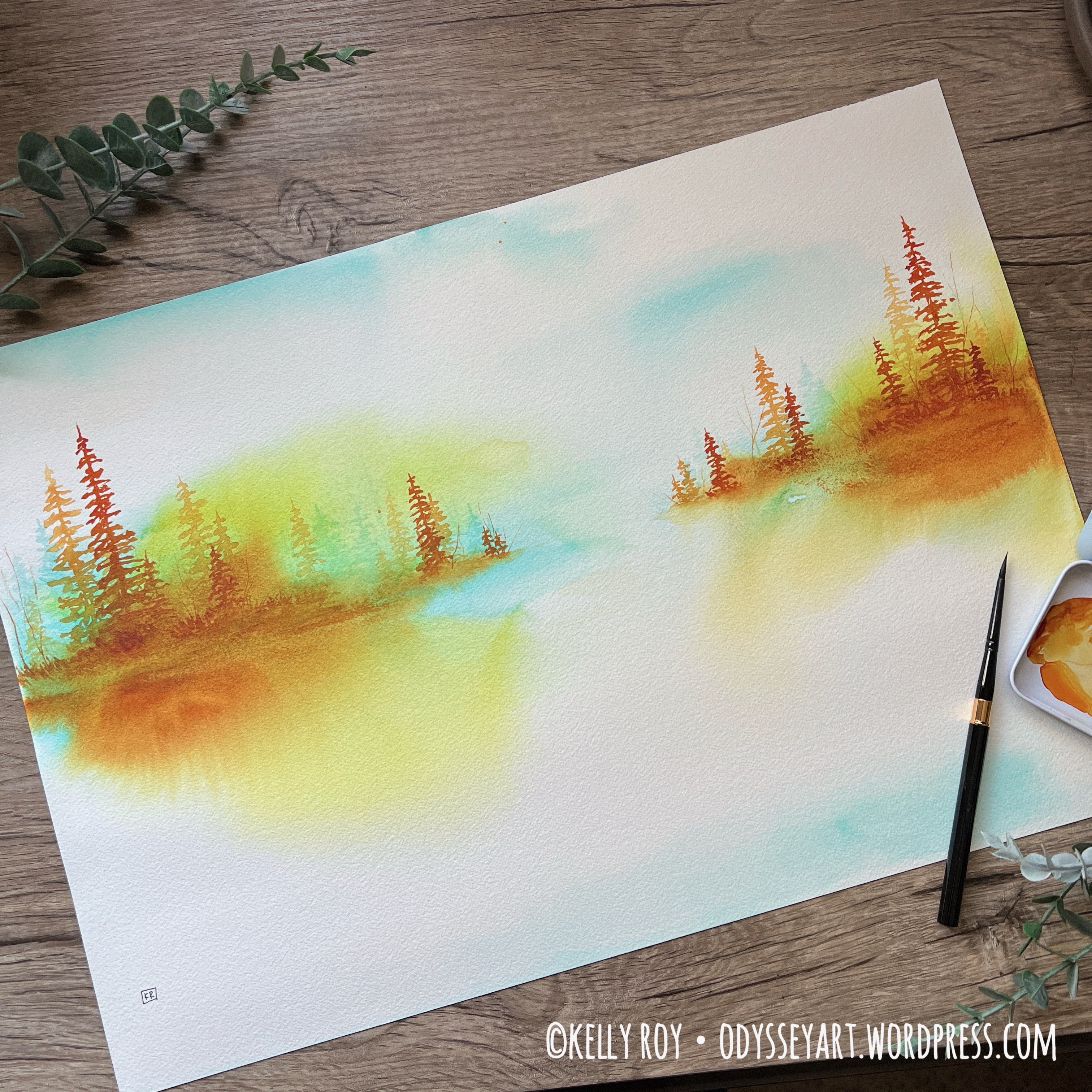
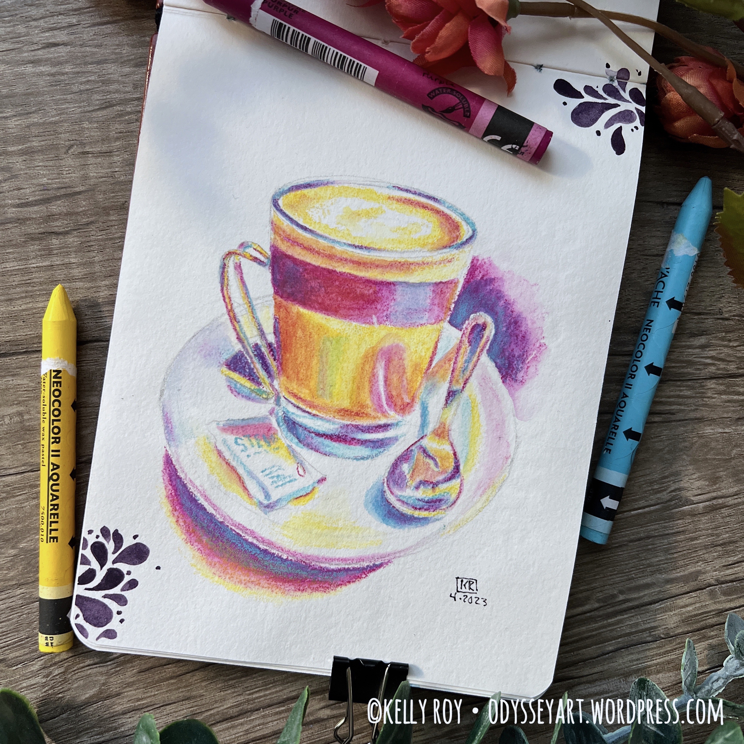
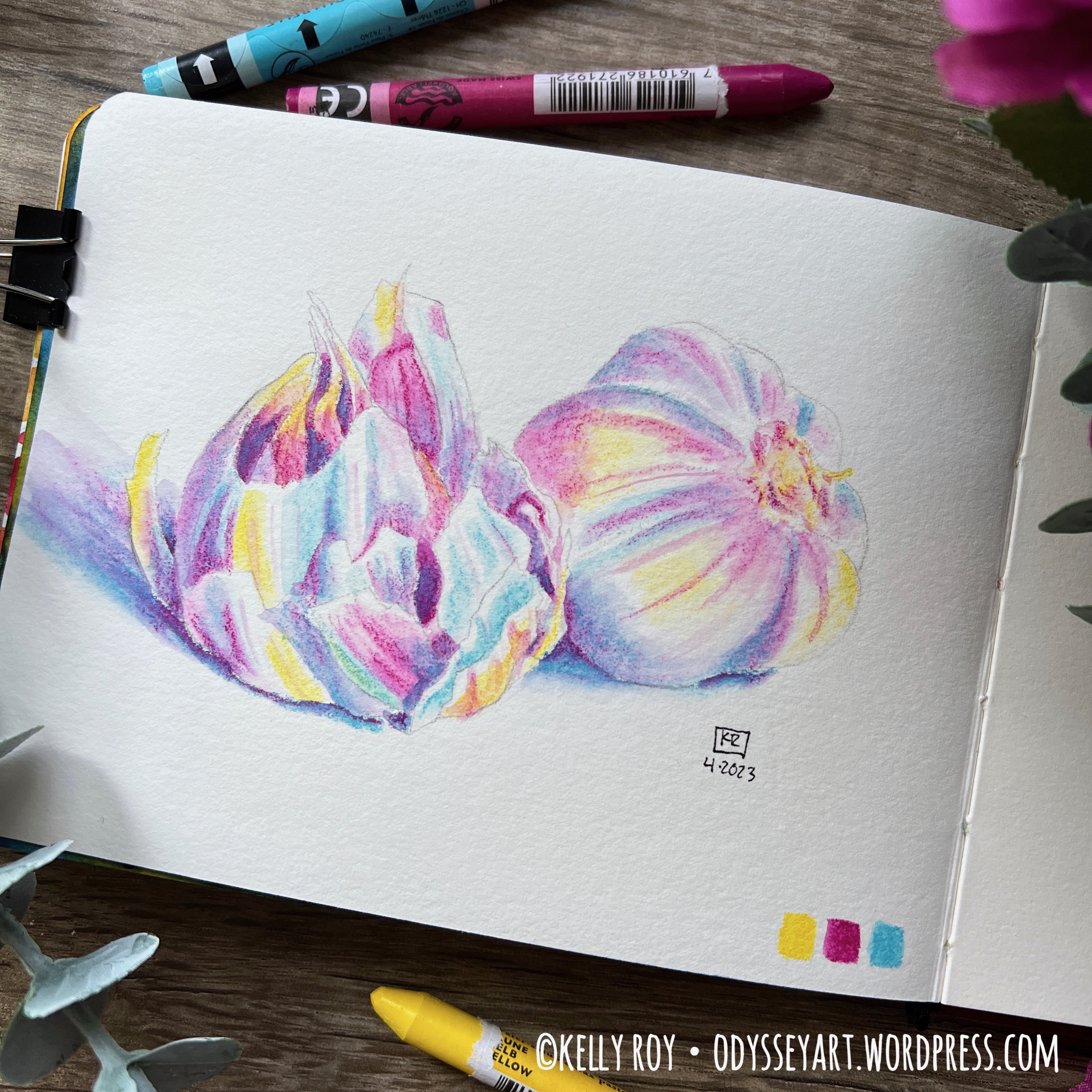
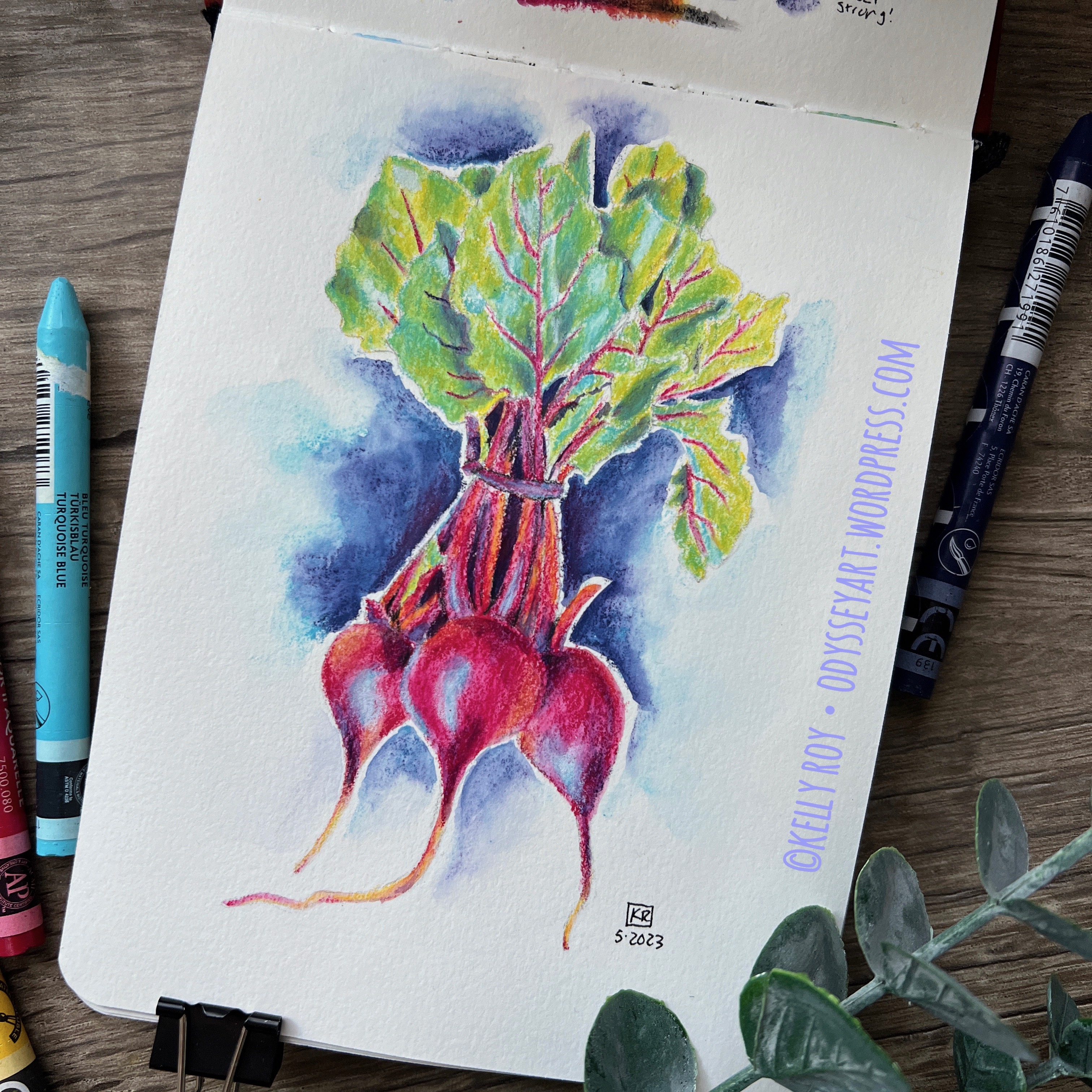
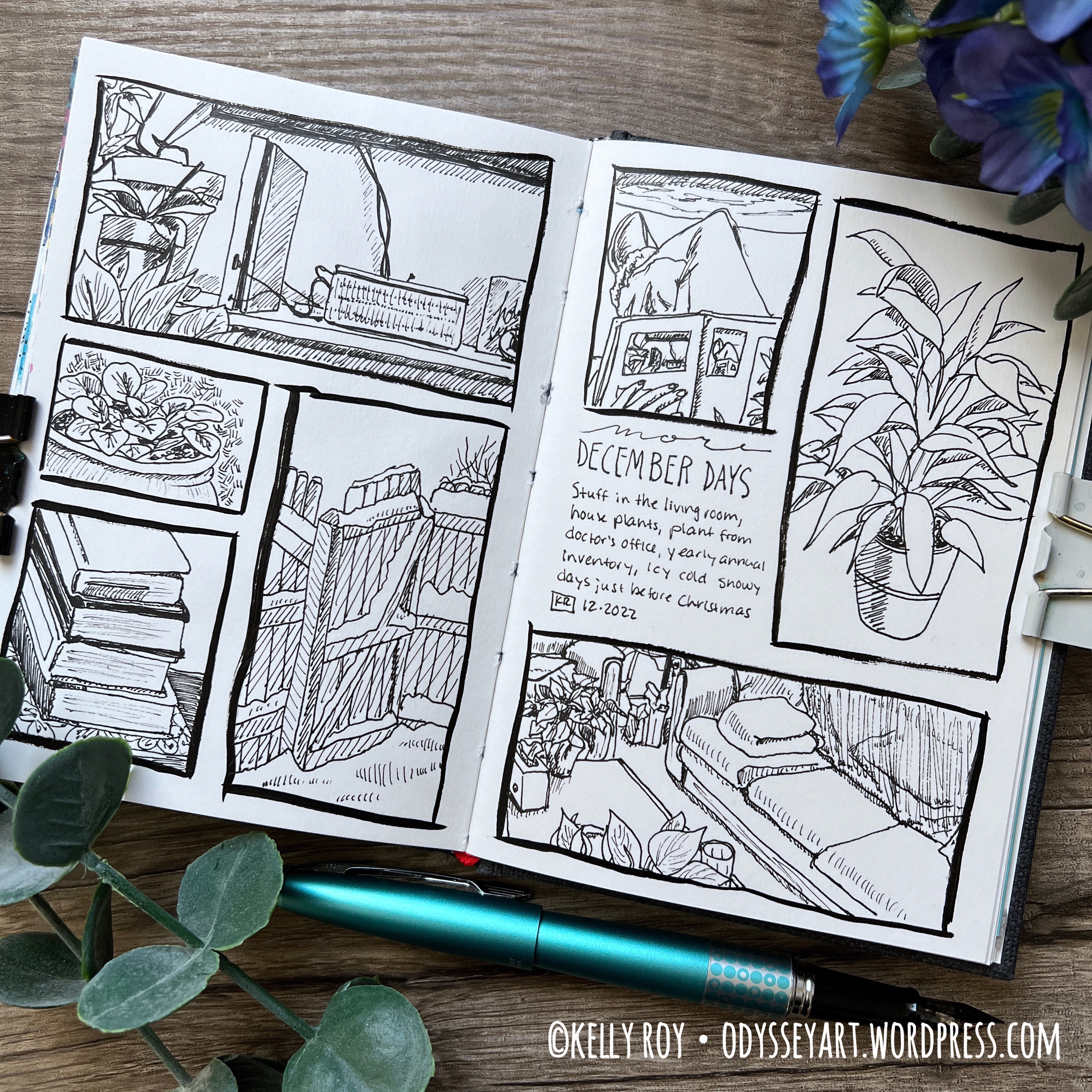
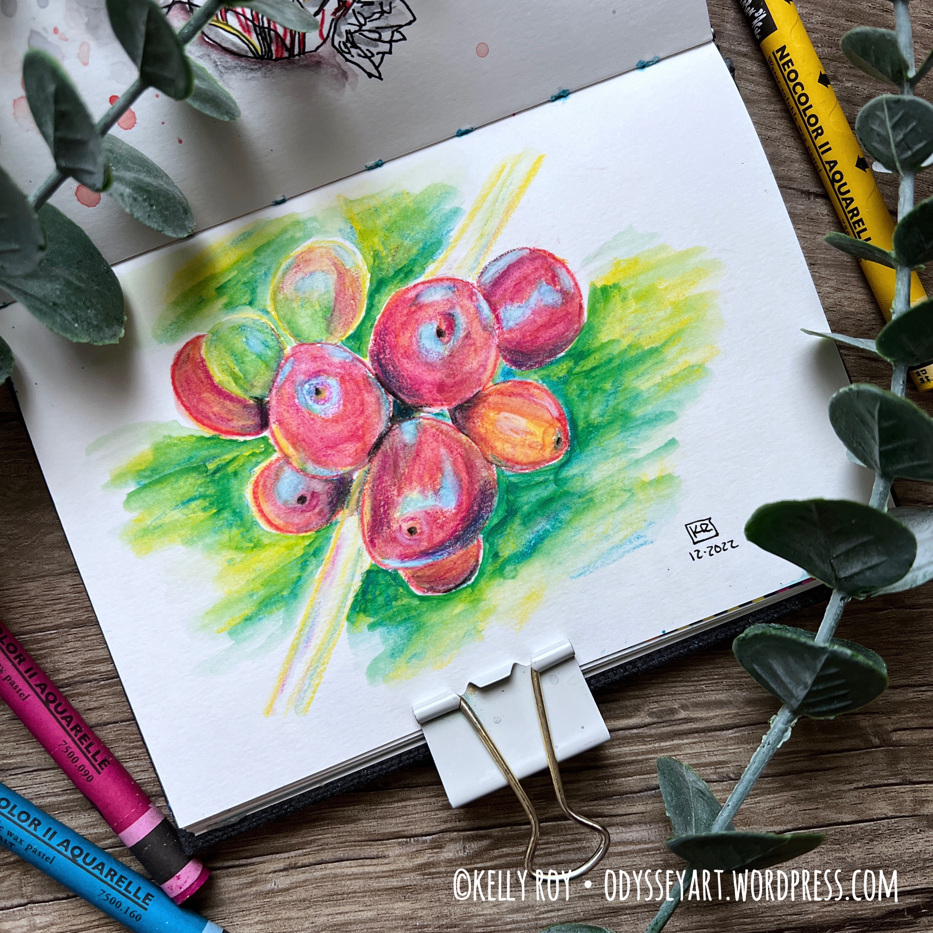
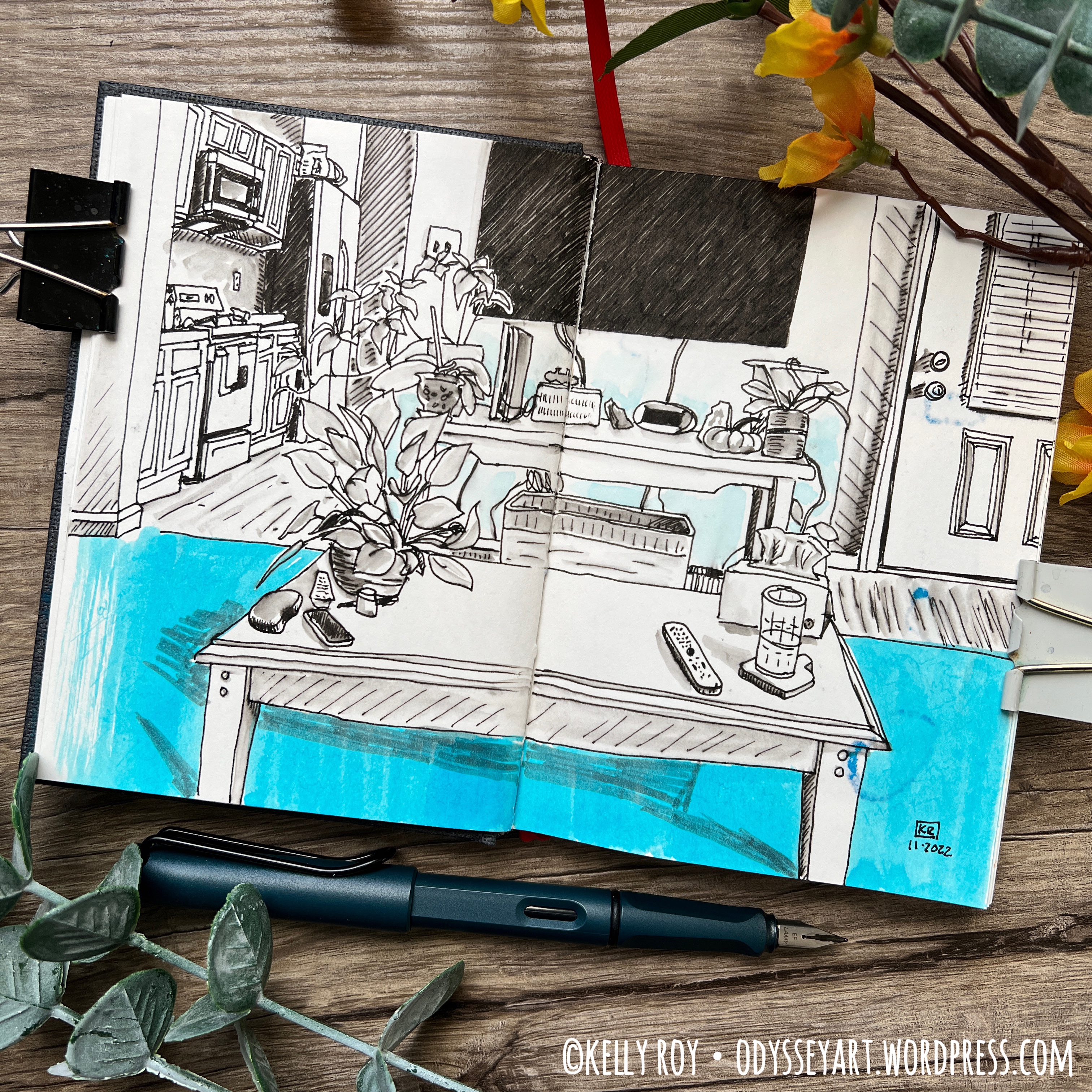
Some of my favorite artworks from this sketchbook:
Be sure to follow my Instagram account @kellyro77 to stay up-to-date on my creative endeavors.
Contains affiliate links. See disclosure for more info.
Etchr 100% Cotton Watercolor Sketchbook, Hot Press
Caran d’Ache Museum Aquarelle Watercolor Pencils
Caran d’Ache Neocolor II water soluble pastels
Schmincke Horadam Aquarelle Watercolors
QoR Watercolors
Faber-Castell Pitt Artist Pens
Pentel Aquash Water Brushes
Platinum Carbon Ink
TWSBI Eco Fountain Pen
Washi Tape
Binder Clips
As an Amazon Associate I earn from qualifying purchases. A list of materials can be found at the end of this post. As usual, please note that any links to Amazon products within this post are affiliate links, meaning I make a minute commission should you choose to purchase something via the link. This is at no additional cost to you. That said, I appreciate your patronage by using the links to purchase products. While small, any amount of money helps me to keep making art and sharing it with the world.
I’m sitting here this evening while there’s a deliciously intense, house-shaking thunderstorm going on outside with a heavy deluge of rain. I know the weather’s been pretty hot and dry through a lot of the country this summer, but here in Colorado, we’ve been blessed for once with quite a bit of rain. Some of my friends have been complaining about all the rain, but not me. I’ll take this over our usual hot, dry summer days.
My only complaint, really, is that I have to keep scurrying around the house closing windows else the rain comes in.
My “art-ing” has slowed down a bit over the last couple months. I really can’t explain why, other than that I’ve just not been feeling really creatively inspired much lately. Considering I’ve been being at least somewhat creative since this time last year, I suppose a lull isn’t something to get too concerned about. But I am missing that creative spark lately. That excitement to hurry up and open my sketchbook and start putting ink or color on the page. It just hasn’t been present, at least not frequently.
So, it’s taken me a little extra time to fill my latest sketchbook. But I’m happy with what I’ve put into it.
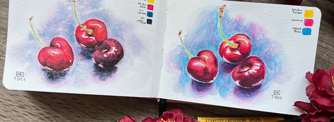
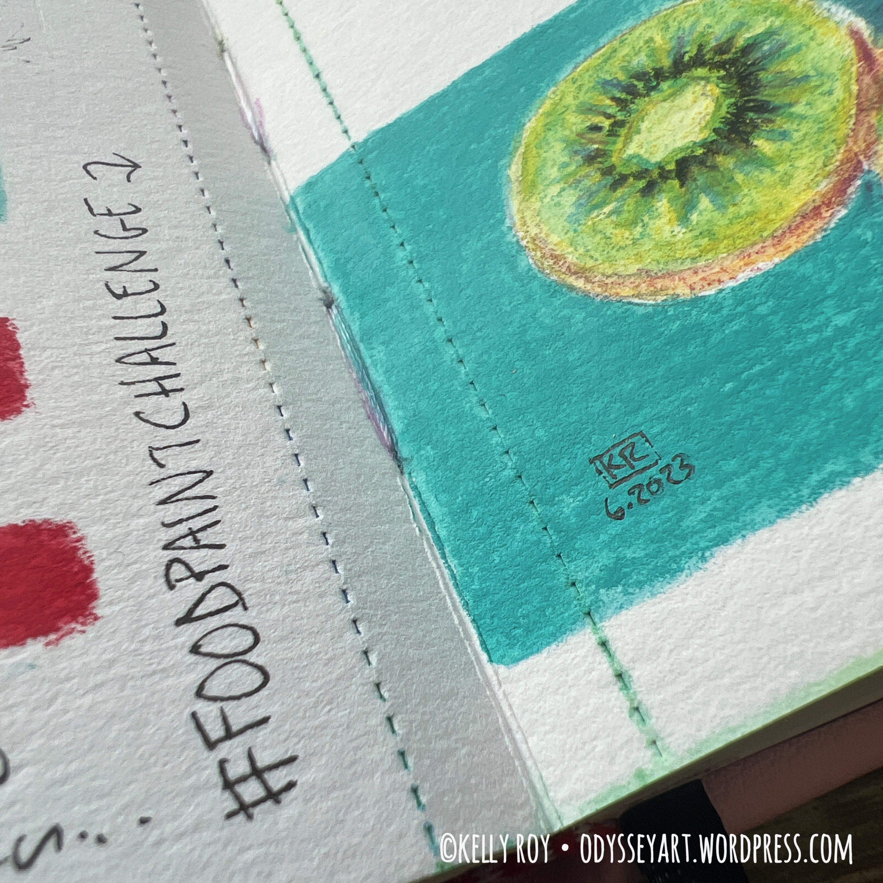
I’ve been continuing to participate in the #foodpaintchallenge weekly prompts on Instagram. Occasionally I’ve decided to do a composition twice to compare watercolor with the Caran d’Ache Neocolor II water-soluble pastels. This has been rather fun, and the exercise helps me keep my watercolor skills fresh. Also a good excuse to say I’ve participated somewhat in this year’s #worldwatercolormonth.
I’ve favored a hot press sketchbook again, as well. Part of me is starting to worry I’m going to start only using hot press sketchbooks, which will leave me with an unfortunate number of un-used cold press sketchbooks.
I’m enjoying hot press because it takes the Neocolors perfectly. Cold press is just too textured and thus leaves the Neocolors looking too “crayon-ish” for my liking.
The bright side of favoring hot press lately means I’ve been honing my watercolor skills on hot press. It was a nasty shock for me the first time I ever tried to paint something on hot press watercolor paper when all I’d ever used in the past was cold press.
So, there’s a silver lining to the hot press obsession. Of course the other benefit of hot press is that it does take watercolor, too, so if I’m in the mood to do watercolor I can.
I also did a little bit of ink illustrating here and there. I like the variation it adds to my pages when I filp throught my sketchbook.
This Paul Rubens sketchbook was a fun little sketchbook to work in. Its smaller size seemed to support my limited creativity lately. Meaning, it was pretty quick to fill a page. I’m going to move on to a larger sketchbook next, however. If you’re curious about the Paul Rubens sketchbook, I posted a review about it the other day, so hop on over and check it out.
I didn’t log quite as many “sketch dates” in this sketchbook as I did in the previous Baohong Academy sketchbook. I took it to a park once, and a book store, but most of my “outdoor” illustrating was done on the back deck. The weather’s been perfect for sitting on the deck and sketching.
For my next sketchbook, I’m working in an A5 Etchr Sketchbook. I haven’t really done much sleuthing recently to see if there are possibly any other new and exciting 100% cotton watercolor sketchbook brands out there. If you come across one, by all means, leave me a comment as I’d love to check it out. I’m thinking in the meantime, I’ll just continue using Etchr Sketchbooks and possibly Baohong sketchbooks for future sketchbook-filling endeavors until something new comes on the market to try.
OR, maybe I’ll get really creative and create my own coptic stitch sketchbook with some Arches hot press paper that I have on hand. It’s been a long time since I’ve made my own sketchbook, and, that may just be the little change I need in creative projects to help with my creative slump.
For cold press watercolor sketchbooks, I’m still working in my A5 Etchr Perfect Sketchbook and my Koval Sketchilla Sketchbook. I’ve really slowed down on filling these since I’ve just been so enamored with working with the Neocolor II pastels. I really do need to continue more full watercolor paintings to keep my skills up.
Okay. You know the drill. Sit back, relax, and enjoy the flip-through below. I’ve also included some photos of some of my favorite pieces from this sketchbook below the video embed.
And remember, if you see any paintings you like, check my Redbubble shop as I’ve been uploading prints from this sketchbook there for sale.
Some of my favorite artworks from this sketchbook:


Be sure to follow my Instagram account @kellyro77 to stay up-to-date on my creative endeavors.
Contains affiliate links. See disclosure for more info.
Paul Rubens 100% Cotton Watercolor Sketchbook, Hot Press
Caran d’Ache Museum Aquarelle Watercolor Pencils
Caran d’Ache Neocolor II water soluble pastels
Schmincke Horadam Aquarelle Watercolors
QoR Watercolors
Faber-Castell Pitt Artist Pens
Pentel Aquash Water Brushes
Platinum Carbon Ink
TWSBI Eco Fountain Pen
Washi Tape
Binder Clips
Dorland’s Wax Medium

As an Amazon Associate I earn from qualifying purchases. A list of materials can be found at the end of this post. As usual, please note that any links to Amazon products within this post are affiliate links, meaning I make a minute commission should you choose to purchase something via the link. This is at no additional cost to you. That said, I appreciate your patronage by using the links to purchase products. While small, any amount of money helps me to keep making art and sharing it with the world.
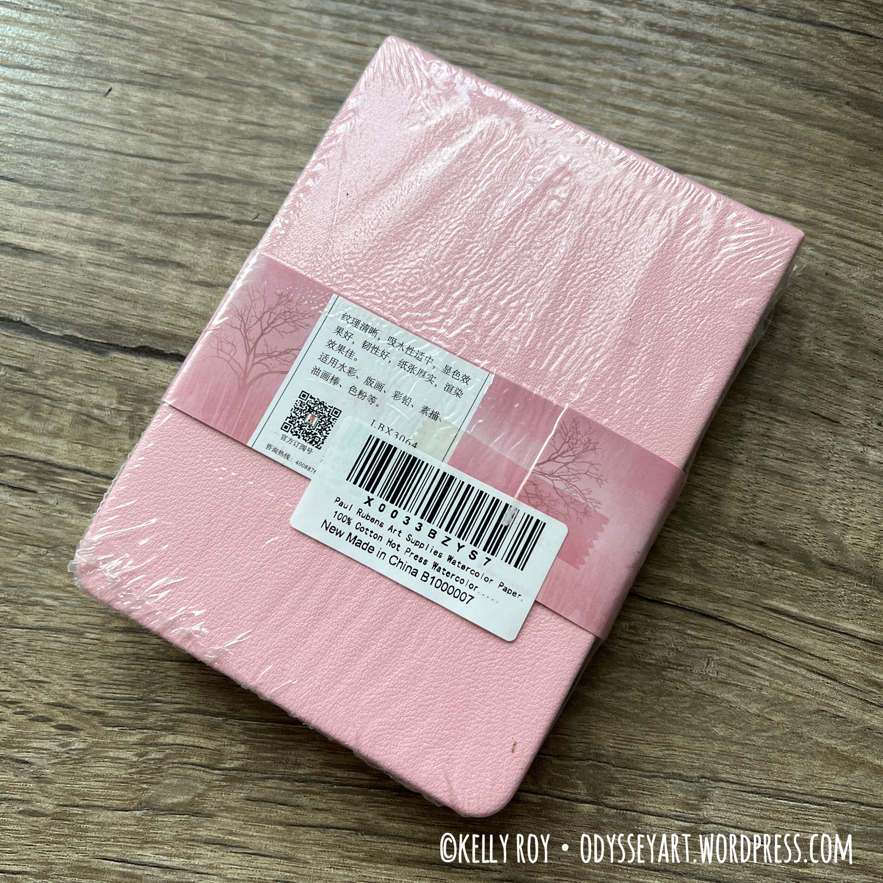
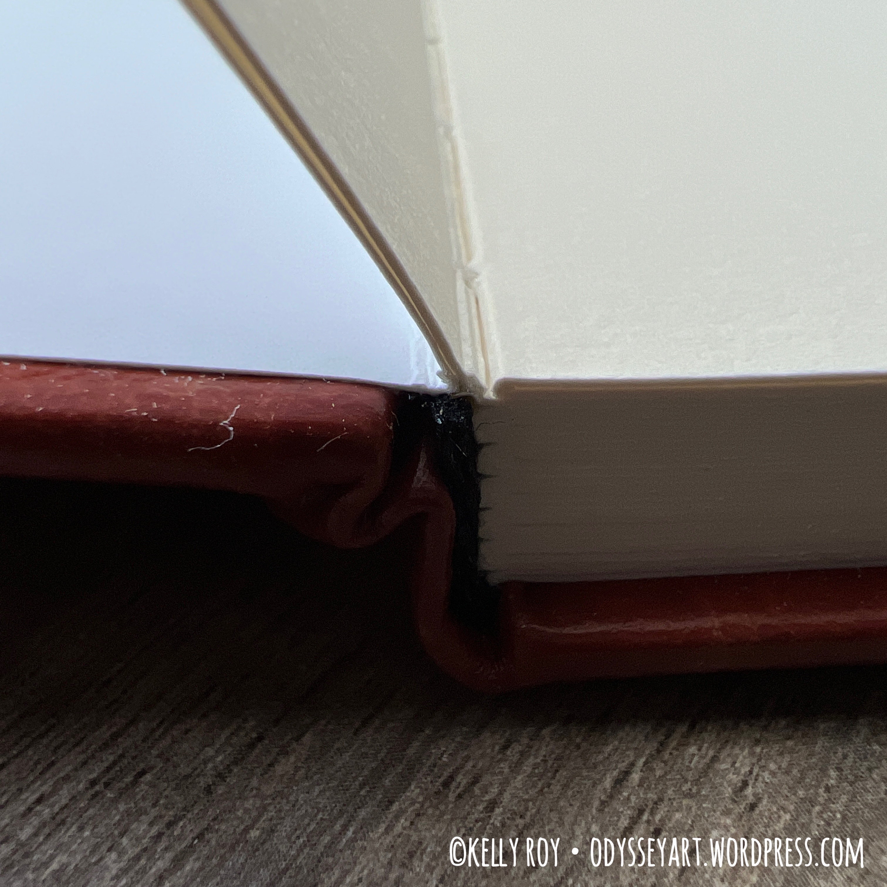
I’ve finally come around to trying out one of the Paul Rubens brand 100% cotton watercolor sketchbooks. I stayed away from them for so long because of the perforated edges in the sketchbooks. When I work in a sketchbook, I generally want the pages to be permanently secured inside.
Well, while shopping for new sketchbooks to try, I came across this sketchbook and was really drawn to the price (about $10* at my time of writing this for the small 3.8″ x 5.2″ size. *Remember, price can change!)
When I went to purchase this sketchbook, I wasn’t paying any attention to the description beyond whether it was 100% cotton, so I’d forgotten about the perforated pages. So here I ended up with this sketchbook after avoiding it for so many years. Destiny, I suppose.
I’m kind of glad I forgot about the perforations, because this really did give me a chance to try out the paper and see what I thought of it. This actually turned out to be a nice sketchbook for the most part, perforation aside.
These are competitively-priced when comparing them to some of the other popular brands out there, like the white canvas-covered Etchr Sketchbooks. That’s a big draw when you can find yourself paying upwards of $50 for an A5 sketchbook with top-of-the-line paper in it (looking Koval’s way. Not a dig at them, though, they do use best-quality paper and their craftsmanship is beautiful.)
So lets get into what this sketchbook is like.
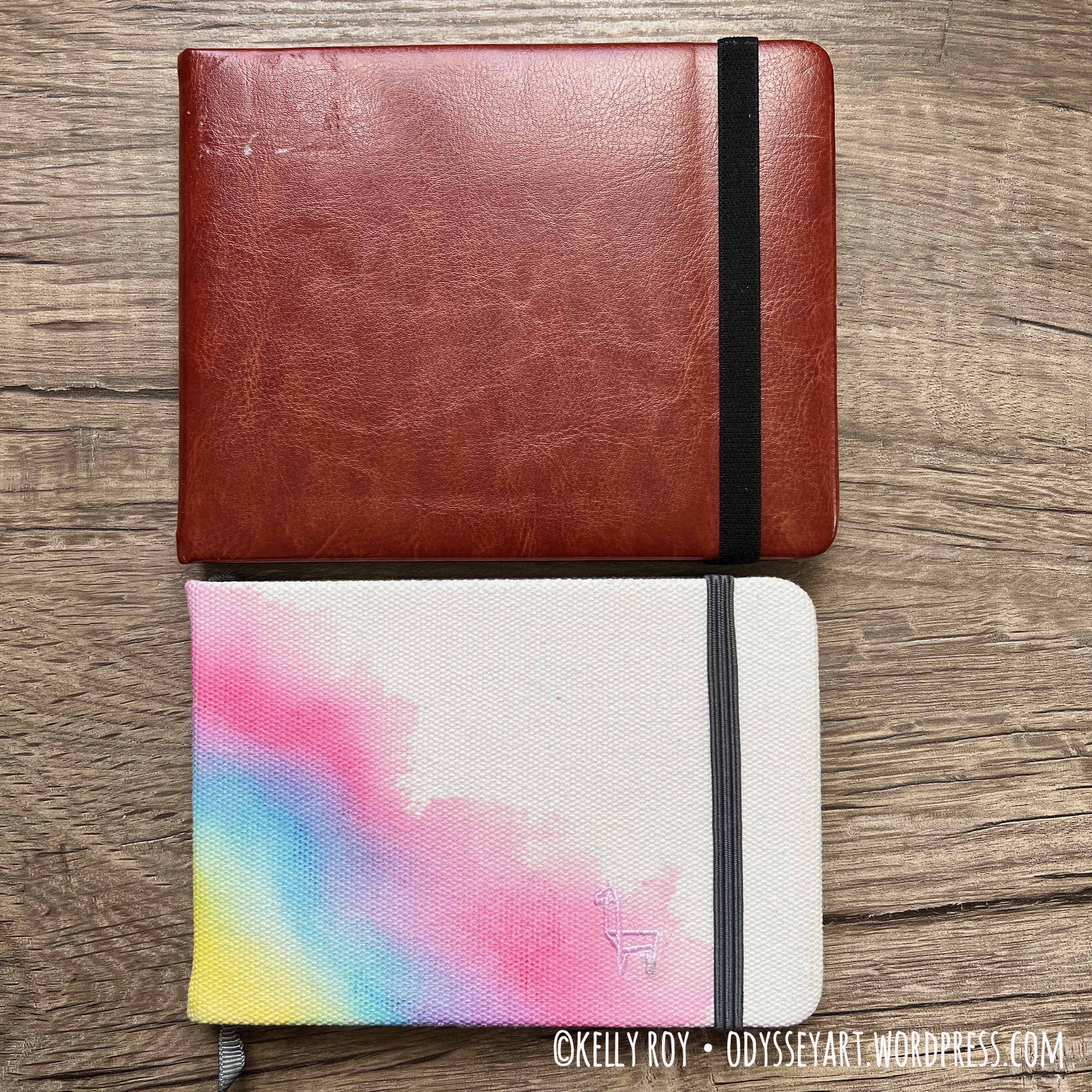
This is a hardcover sketchbook which appears to be covered with faux leather. They either come in black or pink, so depending on how daring you’re feeling, you can let your personality shine with your color selection. The front of the sketchbook has their logo printed on it in metallic gold.
It comes shrink-wrapped in plastic with their branding wrapped around the book. The book features a more-than-generously long ribbon bookmark, but no elastic closure band.


I could do without the bookmark and would rather have had a closure band, as this sketchbook tends to alligator open.

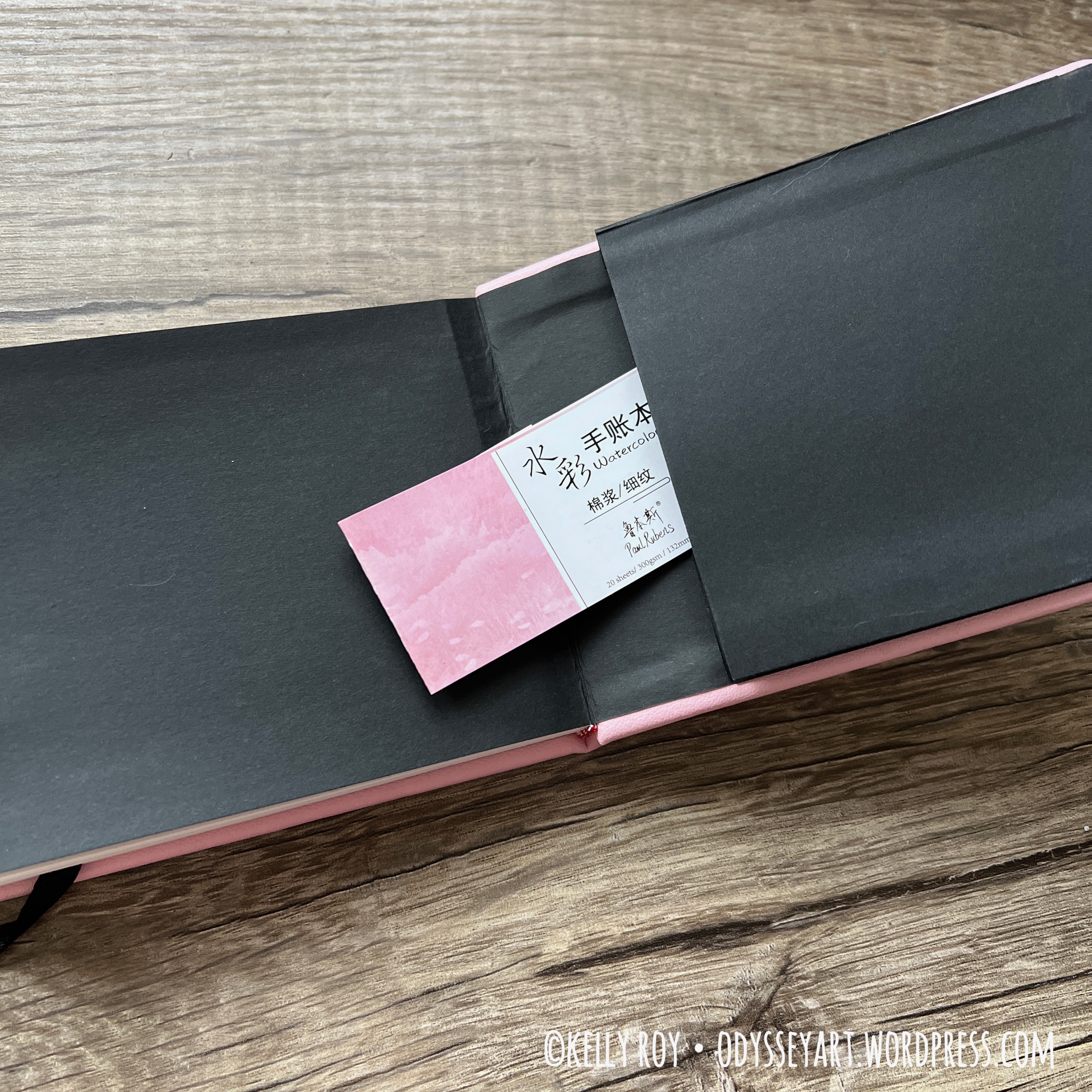
Instead of watercolor end pages, this sketchbook uses black paper. I suppose it’s a kind of nice aesthetic touch, although it prevents you from doing any sort of a wet media opening spread.
The back of the sketchbook features a pocket where you can stick business cards and the like. I tucked the packaging label inside here in case I want to refer to it for future reference, although most of it is in Chinese. (Paul Rubens brand art supplies are manufactured in China.)

I reserved the back end pages for scribble tests and the like.
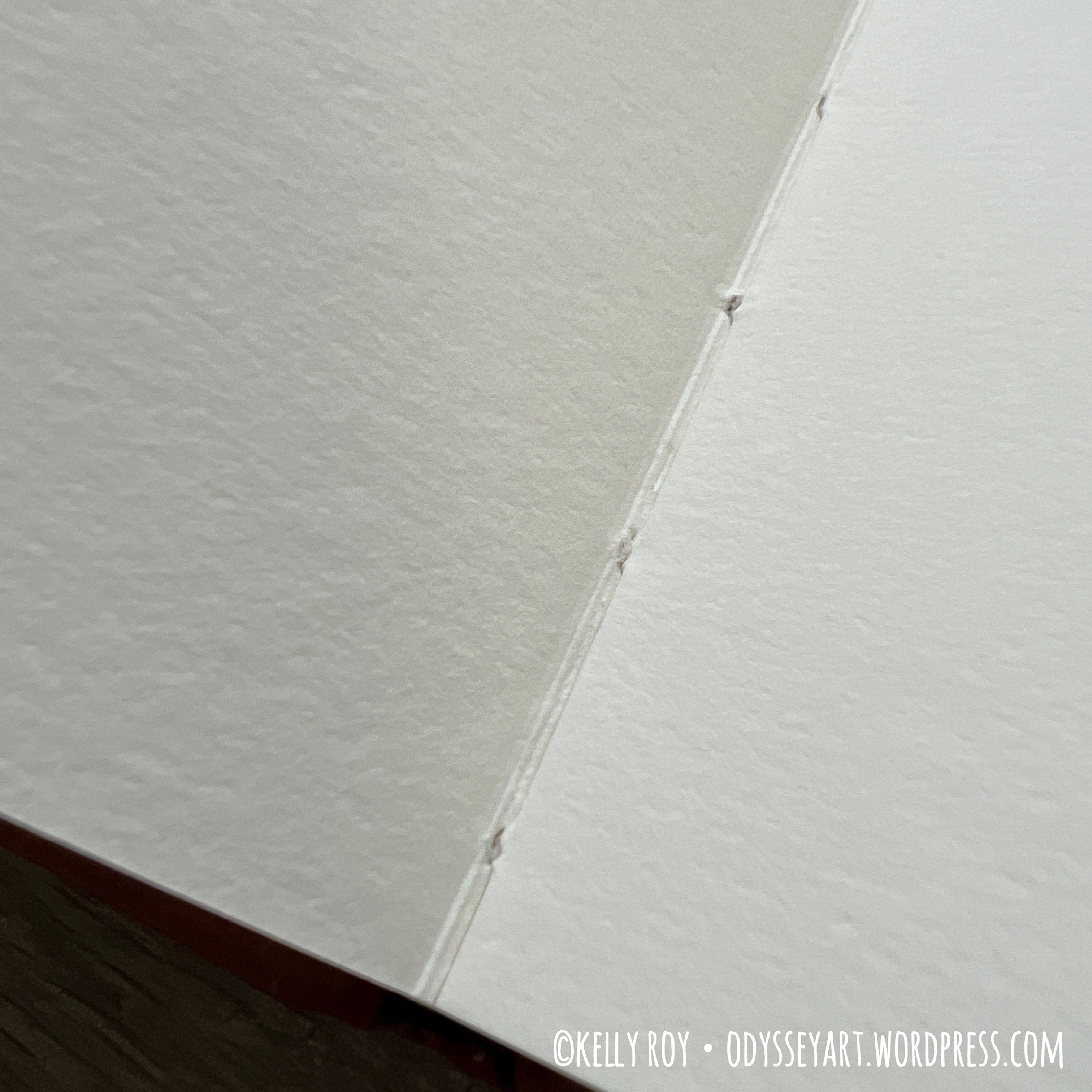
This book is case-bound but features perforated pages. Not ideal, I think, for permanent storage of your artwork in a sketchbook, but ideal, perhaps for those of you who like to use sketch pads and remove your artwork.

As is typical with most case-bound sketchbooks, the first and last spreads in the sketchbook will not lay flat. I consider those pages sacrificial any more and just use them for scribbles, ink tests, etc.
On to the paper itself.
It’s a nice, thick 140-lb (300gsm) paper, very similar to the paper in the Baohong sketchbook I reviewed last. I definitely appreciate thicker paper in my sketchbooks since it helps reduce warping.
From what I can tell, these 100% cotton sketchbooks only come in hot press (and maybe that was another reason I’d never bought one before, as I tended to work exclusively on cold press for quite a while.) They have a cold press paper, but it’s 50% cotton.
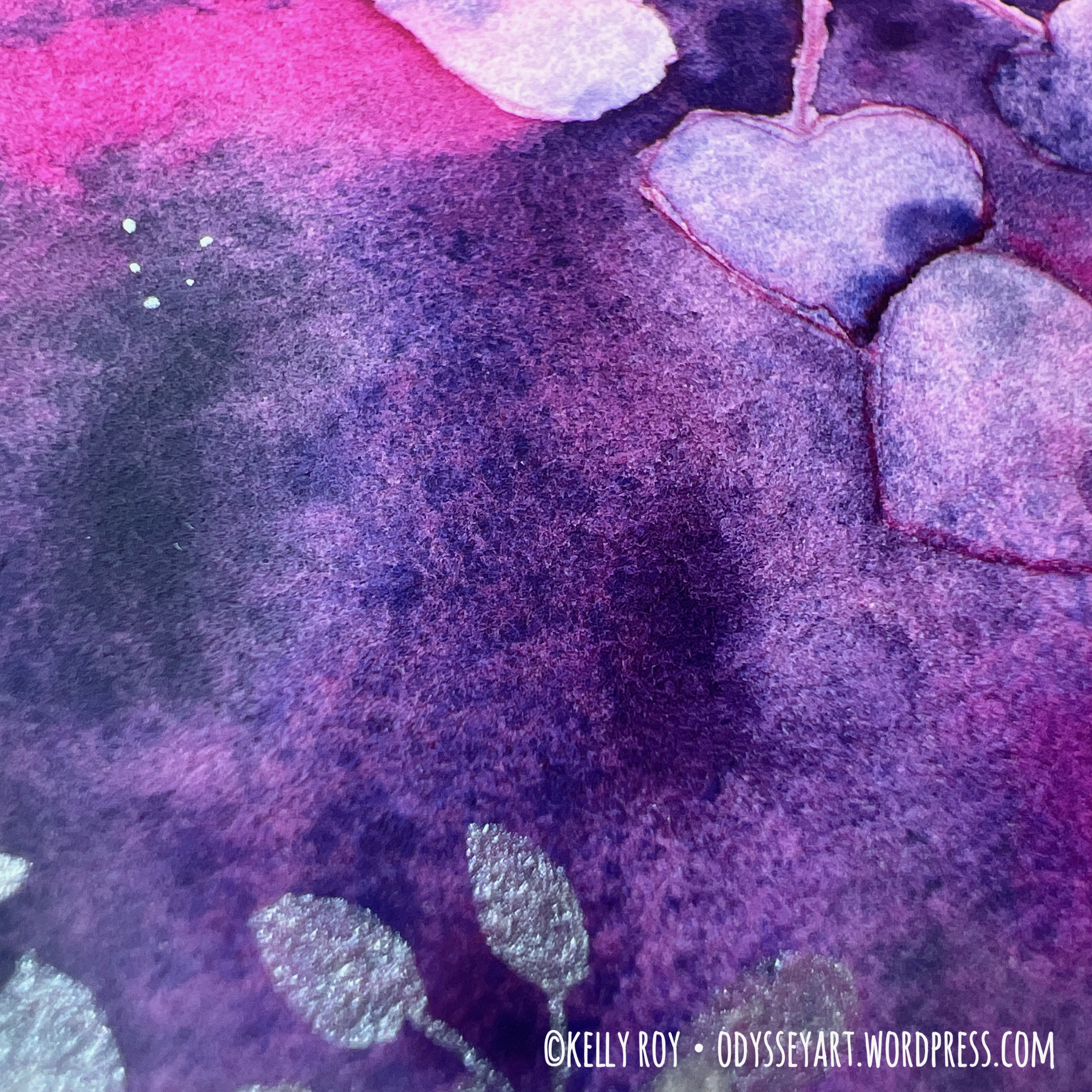
This paper was really nice to work on. I did a few watercolor-only paintings in this, and it did a great job. The texture of the hot press paper supported all my work with Neocolor II pastels wonderfully, as well as my Caran d’Ache Museum Aquarelle watercolor colored pencils. It also took ink nicely. I didn’t really see any feathering where the ink was concerned, and the paper did just fine with layers of wet media. It even did a beautiful job showcasing granulation with my watercolors. Colors looked beautiful and vibrant.
It held up nicely to masking fluid and washi tape, too, although I didn’t use either much in this sketchbook except maybe a couple times at the most.
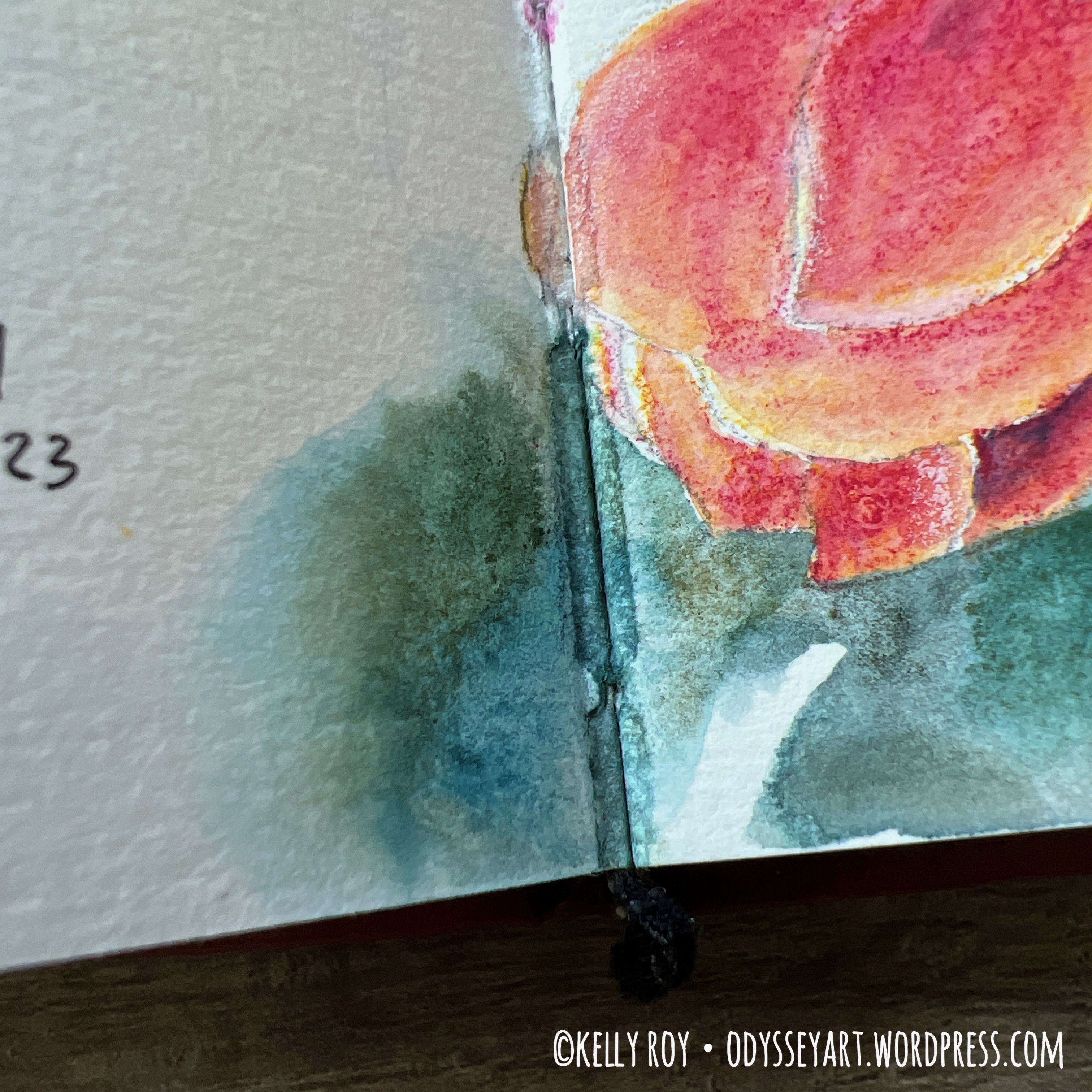
There was a little bleed-through when painting an entire spread across the center. It’s just pretty impossible to make something water-tight when you have stitch binding. This is something to also watch out for when painting over the perforations. While paint didn’t just rush through the perforation marks, you can definitely see it peeking through on the back side of the page where you painted over the perforation.
The page count is 38 pages front and back. 40 if you want to count the somewhat unusable pages at the ends of the book that I mentioned earlier.
There’s very little difference in the texture of the pages from front to back, and I found I encountered minimal warping and bucking of the pages where I painted with watercolor.
So, would I recommend these sketchbooks? I think so, so long as the perforation doesn’t put you off. The price is really good compared to similar brands and really, the paper itself Is pretty nice. These sketchbooks also feel very well put-together.
In conclusion, this is a great product for any watercolor artist who enjoys working in sketchbooks on nice 100% cotton paper.
| Pros | Cons |
| 100% cotton paper Thick, 300gsm paper Hardcover Lay flat binding | No elastic closure Perforated pages |
Have you used a Paul Rubens 100% cotton student grade sketchbook? What are your thoughts?
Be sure to follow my Instagram account @kellyro77 to stay up-to-date on my creative endeavors.
Contains affiliate links. See disclosure for more info.
Paul Rubens 100% Cotton Hot Press Watercolor Journal
Etchr Sketchbook
Caran d’Ache Neocolor II Pastels
Pebeo Drawing Gum masking fluid
Princeton Neptune Watercolor Brushes
QoR Watercolors
Platinum Carbon Ink
TWSBI Eco Fountain Pen
Are you using your sketchbook wrong?
Lately, I’ve been coming across people sharing strong opinions about what kind of art should be in your sketchbook and what kind of art should be shared from sketchbooks.
The discussion usually goes like this: Your sketchbook is supposed to be a place for experimentation, free of any and all pressure. The trend of artists posting finished pieces from their sketchbooks on social media is misleading because artwork in sketchbooks is supposed to only be messy and unrefined. Sketchbooks are supposed to be used to grow your skills and learn. They are not a place for finished artworks.
There’s an unsaid message there that insinuates that artists who post finished works from their sketchbooks are somehow being disingenuous.
I sympathize that this is a revolt, of sorts, against the perfectionism of social media.
Yes, on social media, the majority of us prefer to display our “best”. Best clothing, best vacation spot, best artwork. But can you blame us? How many of you honestly support and like the gnarly, “imperfect” images of those people who are not big influencers with tens of thousands of followers? Sure, if one such big influencer posts a “real” image where they’re finally tired of trying to be perfect all the time, they get lots of love and kudos from their fans for being brave. But do those fans support the people being real who don’t have tons of followers, or do they only like and support those “normal” people’s best images? Think on that.
Another opinion I see people sharing about sketchbooks is that a sketchbook should no longer be called a “sketchbook” if it’s filled with what they define as finished pieces.
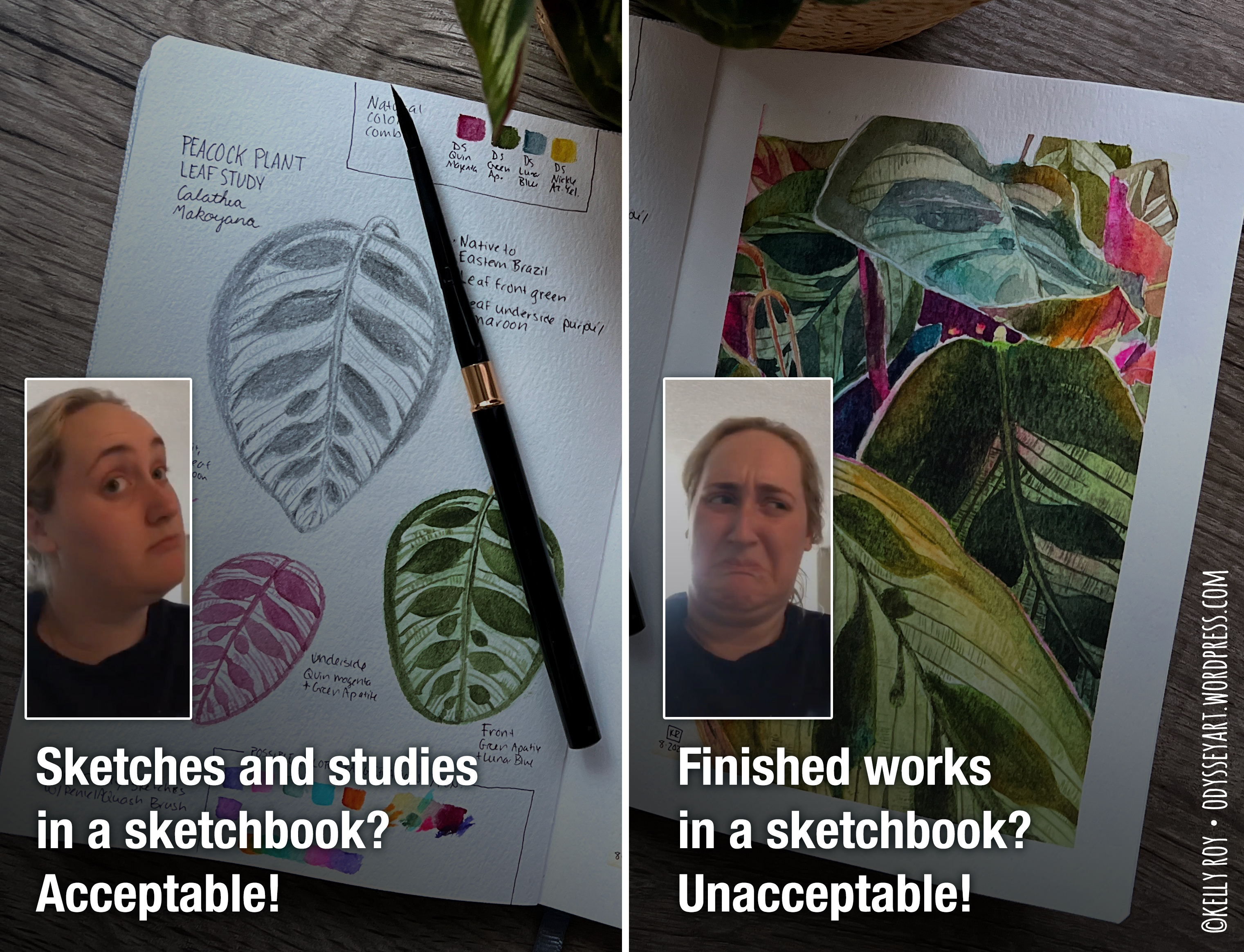
I gotta say I take issue with people laying down “rules” on what’s supposed to be put into a sketchbook, or, for that matter, what’s supposed to be put on a canvas, a pad of paper, or a loose sheet of paper. It’s like we’re back in that annoying place where some uppity art professor thumbs their nose at a student who illustrates amazing Japanese manga art because that’s what they’re intensely interested in. The art professor tells that student “That’s not real art.”
Are we really going to go there now with what kind of artwork should appear in and be shared from sketchbooks?
What I hear when I hear people complain about finished works in a sketchbook is this: “I feel insecure. Your finished artwork exacerbates that feeling. You need to stop so I no longer feel insecure.” Or, when the complaint is coming from an experienced artist, instead the message is: “You are responsible for how other people feel. Your finished pieces in your sketchbook are making new artists insecure. You need to stop sharing finished pieces from your sketchbook so new artists no longer feel insecure.”
There’s a much deeper problem here than the type or quality of art people are doing in and sharing from their sketchbooks. The kind of artwork that is going into and being shared from a sketchbook isn’t the problem at all. The problem is people deciding other people around them are responsible for how they feel about themselves. In this case, people are saying other artists are responsible for how they feel about their own artwork.
Happiness is an inside job.
Let that digest while I set that particular issue aside for a moment and split some hairs defining art, because that’s another side of this opinion being shared on social media; that only certain types of artwork are practice pieces and others are finished pieces.
I’m going to say it. You can’t define art.
Don’t try to pigeonhole and simplify it.
Art is subjective. In the case of the sketchbook artwork argument, what one person calls a finished piece may be a practice piece to another.
Example: I cannot accurately freehand humans and human faces. My proportions are always out of whack. But that’s okay, because I know I would get better at it if I practiced. When I see other artists’ freehand figure drawings, I personally feel they look aesthetic and finished. Meanwhile, to that artist, those figure drawings are just practice scribbles.
So who’s right about whether that piece of art is a finished, aesthetic piece, or a practice sketch? Me, the beginner, or the artist who has 20 years of figure drawing experience under their belt?
To that end, can you imagine the insult you’d put down on someone who worked hard on what they personally defined as a finished piece and you say “Hey! Nice practice sketch!”
I’ve learned over the years through my art journey to not waste time comparing myself to others. Jealousy and insecurity do not leave me feeling creatively inspired.
What does inspire me? Everything! All art is wonderful, and I celebrate it in all its forms. Finished pieces and scribbles alike. I enjoy seeing people’s thumbnails as much as I enjoy seeing 20-foot murals.
I feel better about my art when I don’t get caught up comparing it to other people’s works. I also try to stay away from language like “this is bad” when describing my own work. Staying away from negative language when describing my own art is really just a personal kindness to myself. The perfectionism monster in my head already whispers enough nasty things to me, I don’t need to encourage it with more self-deprecating comments. (This is why I don’t particularly enjoy those posts or videos where artists go back to their old works and give the works a public thrashing. I posted about this a couple years ago on my blog.)
Now, I return to what I said earlier that happiness is an inside job. Artists are not responsible for how other people feel about their own artwork. It is not an artist’s duty to hold other people’s hands and validate them every time a person judges their own work harshly and feels insecure about their abilities. Probably the only exception to this is art teachers, where encouragement goes a long way.
Artists are also not obligated to only share their roughs in order to make less experienced artists feel better. If an artist is proud of their work, be it a “sketch” or a “finished” piece, they have every right to share it or not share it as they see fit, whether it’s in a sketchbook or not.
Each artist must take a deeply personal journey to get to a point where they love and appreciate their own works, whether the work is their definition of “perfect” or not. This journey cannot be accomplished by asking experienced artists to only share their roughs, nor by telling people that the only acceptable place to work on roughs is in a sketchbook.
If you are a new artist, where can you practice your artwork?
Anywhere! You can practice in sketchbooks, on loose sheets of paper, or on a $100 canvas. It’s whatever resonates with you (and what you can afford!) If you feel more confident on napkins, then use napkins. The form your practice surface comes in or on does not matter. And that argument goes for your finished pieces, too. The form your finished piece comes in or on does not matter.
And if you are a new artist, what kind of art is practice? Only pencil line drawings? Only messy blobs of watercolor? Is it no longer a practice piece if you spent time focusing on shading and contrast in a refined composition? Practice is whatever you work on where you learn something from it. Even if the only knowledge you gain from a piece is that you discover that you enjoy making artwork.
Honestly, every piece I put into a sketchbook can be considered practice, whether it actually appears to be a finished piece or not. I learn something from every sketch, every illustration, every painting, every mark, every brushstroke.
What I’d love to see discussed more in the art community is the celebration of people taking time to express their creativity, whether in the form of practice images or completed pieces, regardless of where those pieces are created.
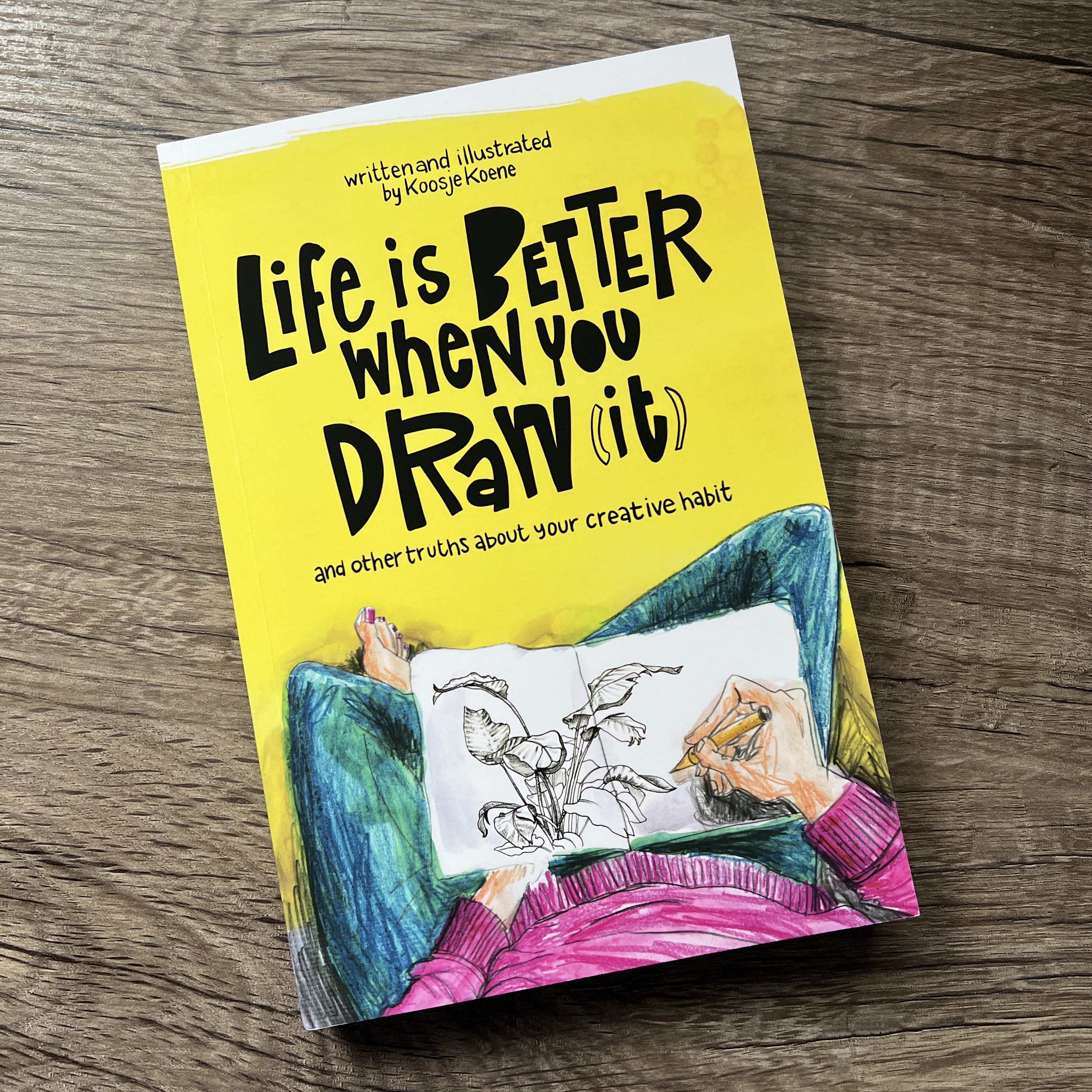
If you haven’t found her already, you might consider checking out Kosje Koone’s YouTube channel. She’s a wonderful, encouraging person who emphasizes that subject matter and “quality” aren’t important. It’s the act of creating that is important. She even wrote a book about it that I definitely recommend. Whether you’re a seasoned artist or a beginner, her refreshing take on the “purpose” of artwork really frees you from the noose of expectations and perfectionism.
So, is someone is “allowed” to call their sketchbook a “sketchbook” if it’s filled with what they define as finished pieces? Call it whatever you want! I use the name “sketchbook” because that’s the market term for them, and it does not matter if the book is filled with what looks like masterpieces or squiggly scribbles.
I love working in sketchbooks because they’re such a convenient way to store my artwork, and I like taking them around with me and doing on-site sketching. But then, as the creator of “World Sketchbook Month“, of course I’m going to say I love sketchbooks!
If you’ve come across this opinion on what should be shared from sketchbooks, I hope this post frees you up from feeling like you are only allowed to create certain types of artworks in or on certain art surfaces. Ignore the black-and-white definitions some people give of what is and is not art, what is and is not a sketch, what is and is not finished, and whether or not you should be allowed to share your artwork because it’s a “finished” piece in a sketchbook, or a stick figure on a canvas.
You’re free to do what you want, wherever you want. Break free of the “shoulds” and go have some fun!
Want to see the kind of artwork I share in my sketchbooks? I share all kinds of stuff! Follow my Instagram account @kellyro77 to stay up-to-date on my creative endeavors.
As an Amazon Associate I earn from qualifying purchases. A list of materials can be found at the end of this post. As usual, please note that any links to Amazon products within this post are affiliate links, meaning I make a minute commission should you choose to purchase something via the link. This is at no additional cost to you. That said, I appreciate your patronage by using the links to purchase products. While small, any amount of money helps me to keep making art and sharing it with the world.
Happy spring, northern-hemisphere people! I’m so grateful to see warm weather returning and that I’ve also finished another sketchbook! That makes two so far this year. This is still quite a slowdown from the pace I was keeping at the end of 2022, but I’m finding it’s a comfortable pace. The fact that I’ve kept working to fill sketchbooks at all says something. Usually during the first few months of the year I go through a creative dry-spell.
To be honest, March and April were pretty rough for me. I’m not going to go into a lot of details, other than that there were some upheavals at my full-time job, and then I’ve been starting to really feel the effects of the changes my body is going through at this stage in my life. Really low, depressive mood swings and insomnia have been unfortunate side-effects. Don’t worry, I’ve been working with my healthcare team to address the issues.
I know when I flip through this sketchbook in the future, I’ll encounter some of those stressful memories. However, there’s a light at the end of this sketchbook, and that’s because I managed a trip back to Hawaii at the end of April to visit with some of my very close, dear friends.
This has been a long, cold, cold, COLD (did I mention “cold”?) winter. Spending some time in tropical, humid, 75-degree weather was just what I needed. I spent so much time outdoors while out there, I think that the extra sunshine and warm air helped restore me a bit, as well as being surrounded by some of the most amazing friends a person could ever ask for.
I really surprised myself while out there that I managed to do quite a bit of artwork. Sometimes I get so busy running around on trips that I find I have little time to barely even scribble something, let alone work on some finished illustrations.
I even made myself proud by sketching at the airports and even on one of my flights!
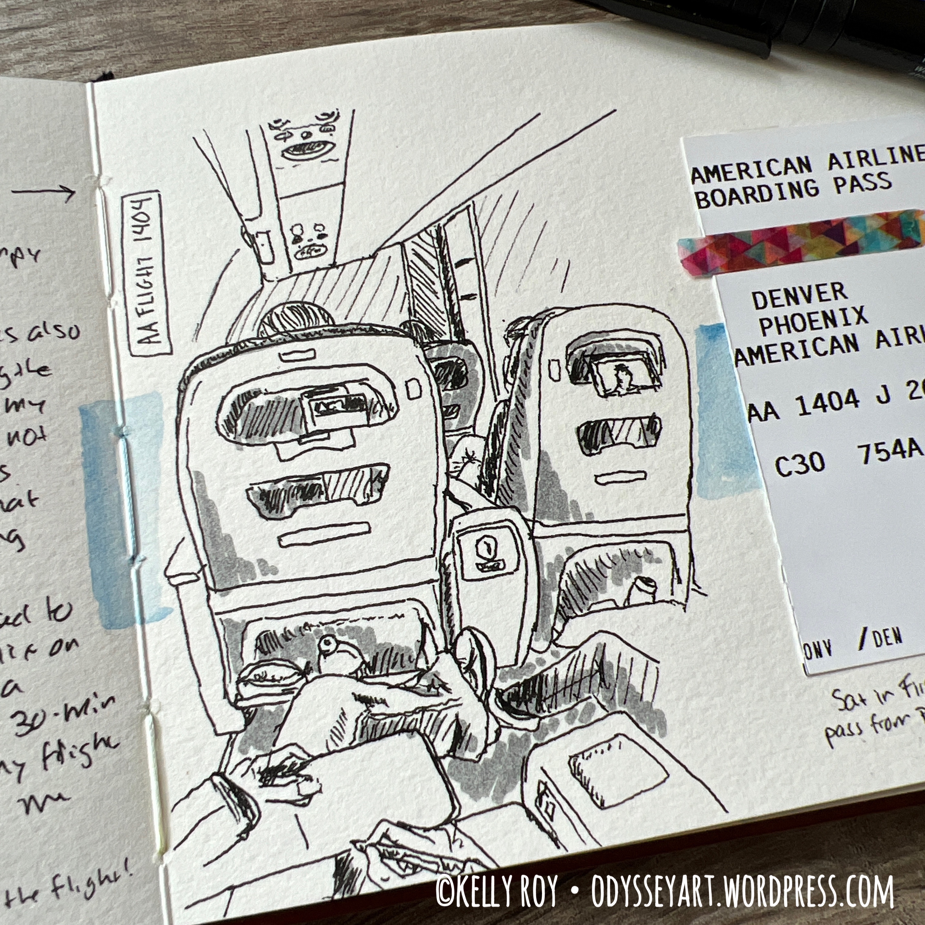

Yay, me! It’s still intimidating at times for me to pull out a sketchbook and draw in the presence of others.
You’re going to see a continuation of a lot of food-related illustrations in this sketchbook. I’ve really been enjoying the #foodpaintchallenge weekly prompts on Instagram. Sometimes their prompt doesn’t appeal to me, but because I really want to keep going, I just choose my own subject.
Three of the illustrations in this sketchbook, for example, were #foodpaintchallenges I used from my own references.

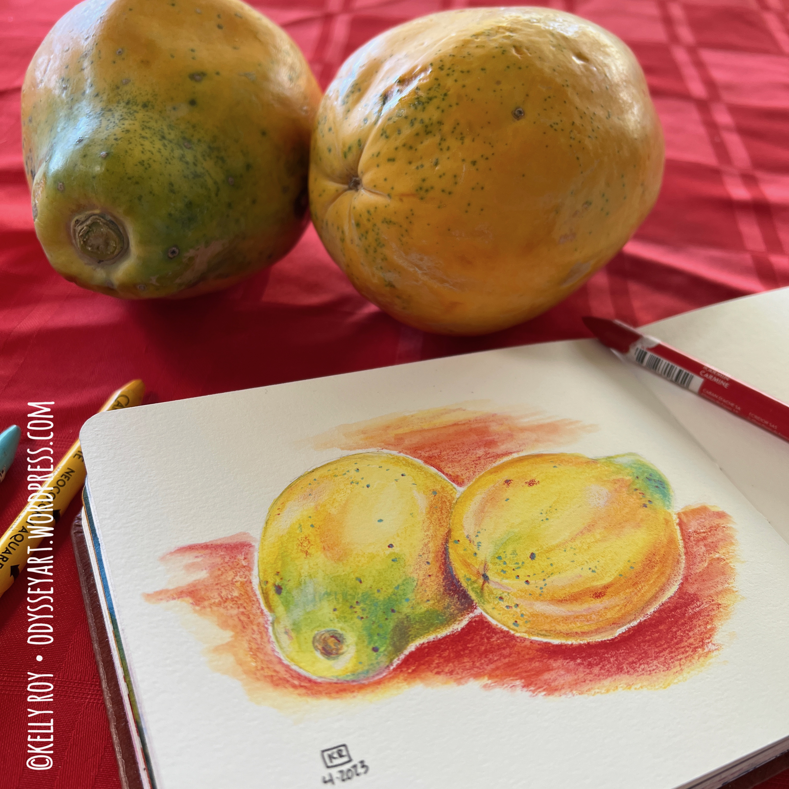

One of those images – the papaya, I did while out in Hawaii. (And if you’re wondering, yes, the papaya was delicious!)
This was also my first time using Baohong Academy paper in their A6 sketchbook. I absolutely loved it and think I’ve found yet another favorite sketchbook. I’m so grateful that us watercolor artists now have so many different high-quality sketchbooks to choose from. If you’re curious about what it was like to work in this sketchbook, I posted a review yesterday.
In addition to my vacation, I took this sketchbook on a couple “sketch dates” to the local Barnes & Noble and did some ink drawing there. And while a good portion of my works in this sketchbok were done with Caran d’Ache Neocolor II water soluble pastels, I also did a couple watercolor paintings.
PS – If you’ve noted a bit of “gloss” on some of my illustrations during the flipthrough below, it’s a wax medium seal. I sealed some of my illustrations because the Neocolors have a tendency to transfer onto facing pages if you’re working on the opposite side of the page and putting down pressure. I used Dorland’s Wax Medium to seal some of the illustrations with heavier color to make sure they didn’t transfer as I progressed through the sketchbook. I was a bit arbitrary in which images I felt needed the wax medium, or which ones I felt comfortable adding the wax to.
This sketchbook is ultimately a real treasure for me. As usual, I’m finding my latest sketchbook has become my new “favorite”.
For my next travel sketchbook, I’m working in a dainty little Paul Ruben’s hot press sketchbook. As usual, I’m always looking to try new sketchbooks and see what I think. Expect a review in the future!
For cold press watercolor sketchbooks, I’m still working in my A5 Etchr Perfect Sketchbook and my Koval Sketchilla Sketchbook. I’ve really slowed down on filling these since I’ve just been so enamored with working with the Neocolor II pastels. I really do need to do some more full watercolor paintings, lest I get rusty!
That’s enough from me. Sit back, relax, and enjoy the flip-through below. I’ve also included some photos of some of my favorite pieces from this sketchbook below the video embed.
And remember, if you see any paintings you like, check my Redbubble shop as I’ve been uploading prints from this sketchbook there for sale.
Some of my favorite artworks from this sketchbook:


Be sure to follow my Instagram account @kellyro77 to stay up-to-date on my creative endeavors.
Contains affiliate links. See disclosure for more info.
Baohong Academy 100% Cotton Watercolor Sketchbook, Hot Press
Caran d’Ache Museum Aquarelle Watercolor Pencils
Caran d’Ache Neocolor II water soluble pastels
Schmincke Horadam Aquarelle Watercolors
QoR Watercolors
Faber-Castell Pitt Artist Pens
Pentel Aquash Water Brushes
Platinum Carbon Ink
TWSBI Eco Fountain Pen
Washi Tape
Binder Clips
Dorland’s Wax Medium
Another quality watercolor sketchbook.
As an Amazon Associate I earn from qualifying purchases. A list of materials can be found at the end of this post. As usual, please note that any links to Amazon products within this post are affiliate links, meaning I make a minute commission should you choose to purchase something via the link. This is at no additional cost to you. That said, I appreciate your patronage by using the links to purchase products. While small, any amount of money helps me to keep making art and sharing it with the world.
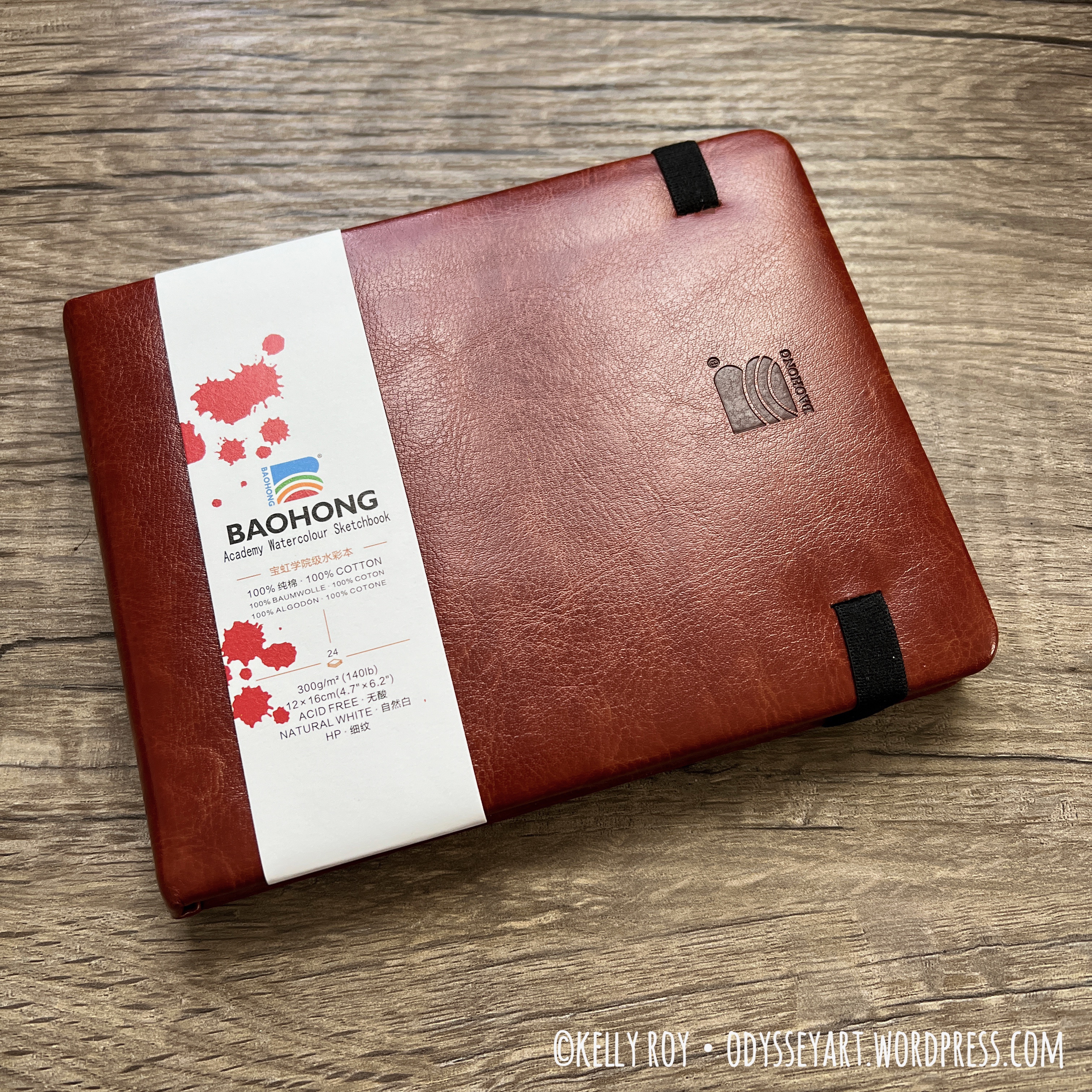
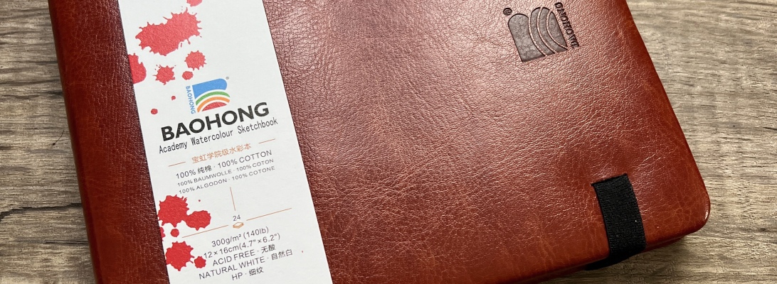
Just when I was starting to think the market had maxed out on 100% cotton watercolor sketchbooks, I come across this little gem: the Baohong Academy Watercolor Sketchbook.
I’ve heard about Baohong paper maybe once before. It’s not something I see talked about much, at least in the artist circles I follow. However, a while ago, I stumbled on a YouTube video by Kris DeBruine talking about Baohong paper being one of the best, “student grade” 100% cotton watercolor papers you can find. Mind, she was talking about the paper itself, not sketchbooks.
First, my mind was blown. A student grade 100% cotton watercolor paper? Well, thanks to Baohong, yes, such a thing exists. Are you paying attention, Canson, Arches, and others? Truly, I’m used to student grade being terrible cellulose blends, so this was really amazing to me.
I was intrigued by her review of the paper so decided to try my luck to see if they actually made any sketchbooks. Lo and behold, they do! They are available in both hot and cold press. As of my writing this post, the cold press version comes in two different sizes, as well, while the hot press only comes in something close to an A6 (4.7″ X 6.2″). The product page for this on Amazon actually showcases both hot and cold press in at least three different sizes, but the Amazon store didn’t have them all. Perhaps they’ll stock more in the future.
Price-wise, I was a little disappointed to find that the sketchbooks weren’t really less expensive than some of the other popular brands out there, like the white canvas-covered Etchr Sketchbooks. I still wanted to try it out regardless. After all, I seem to have created a niche for myself in reviewing sketchbooks, especially watercolor sketchbooks. One more sketchbook to add to my review list!
This is a hardcover sketchbook which appears to be covered with faux leather that has a sort of “puffiness” to it, for lack of a better description. The back of the sketchbook has their logo embossed on it.


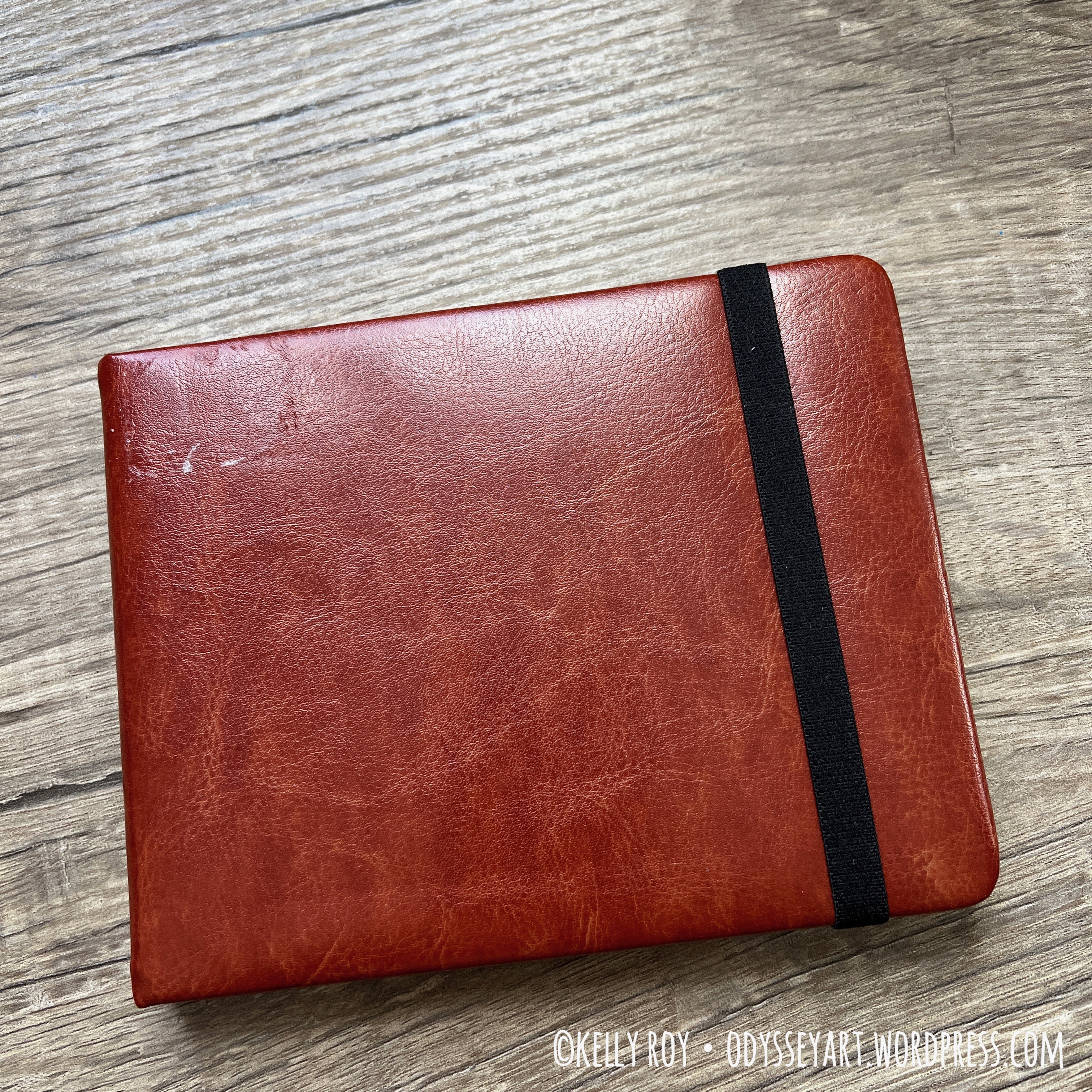
When you receive this sketchbook, you’ll note that they package it in a way to make it appear that the logo is on the front, with the elastic closure getting wrapped around the back of the sketchbook, instead of how you usually see most western brand sketchbooks wrapping the elastic closure around the front. I couldn’t get used to that reverse use of the elastic closure, so I flipped the book so the logo was on the back and used it that way.
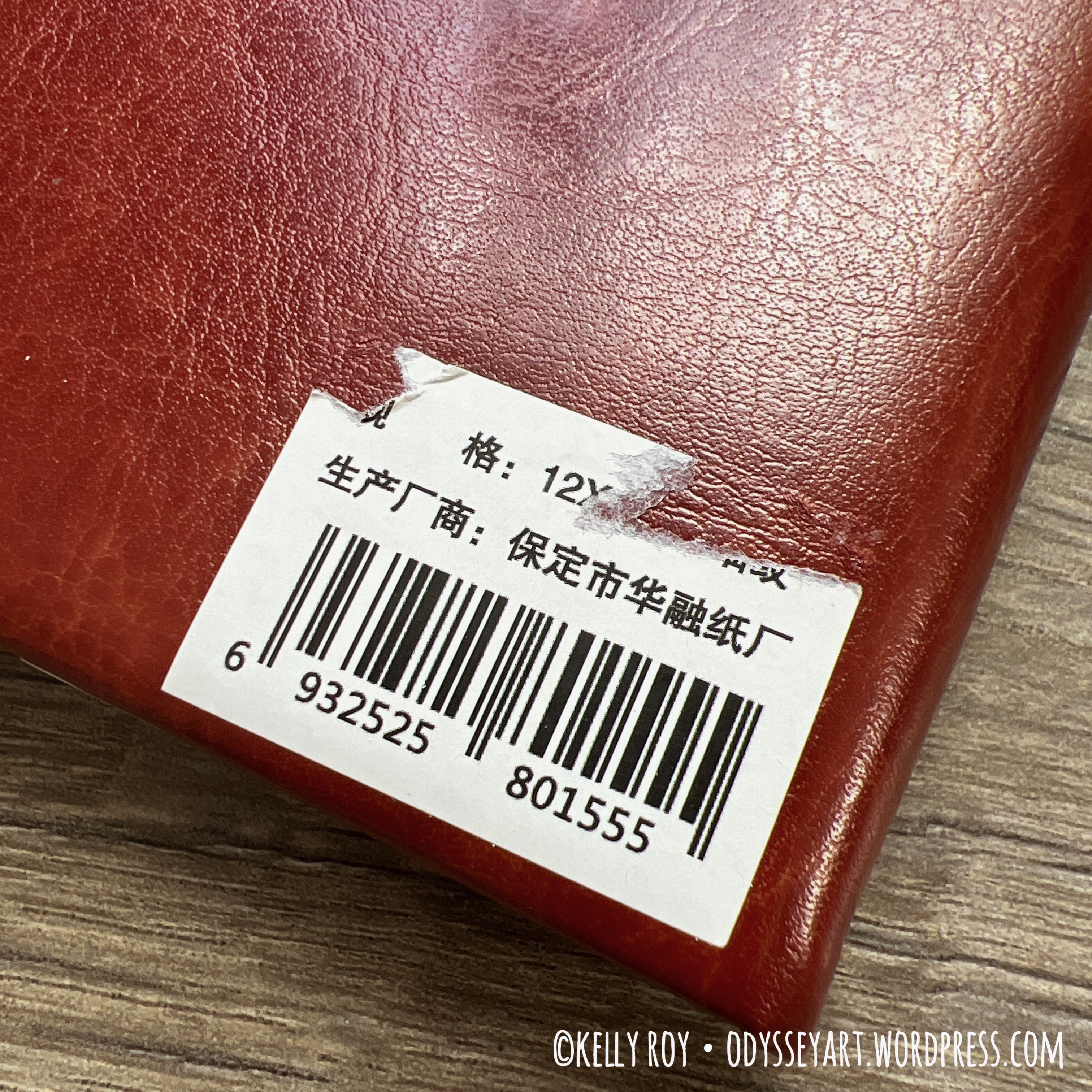
Because of how they package this, they also put their UPC sticker on what I consider the “front” of the book. And, unfortunately, the UPC sticker does not peel off easily. Mine ended up leaving residue behind. I’m sure I could have probably removed it with maybe a razor, but I made my life a little easier by just putting a decorative sticker over the top of the residue, instead. Problem solved.

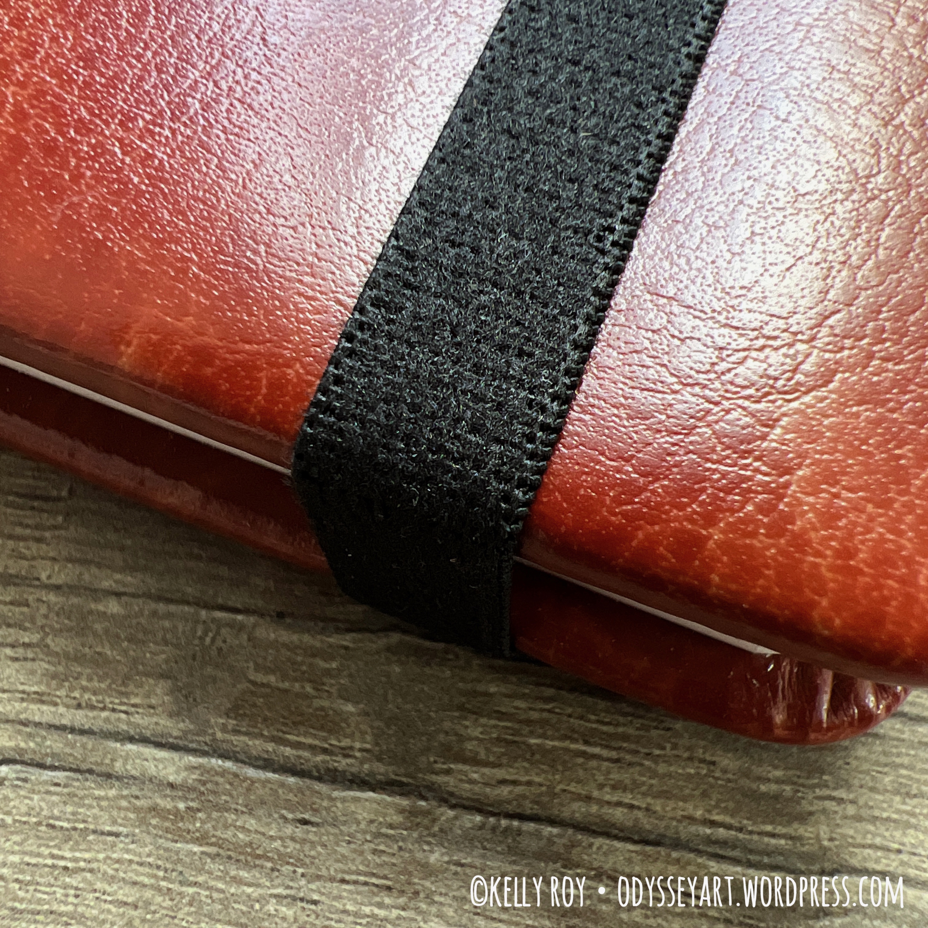
The elastic closure is pretty nice. One side of it is a smooth ribbon texture, while the other is very soft to the touch. It also feels really sturdy. It did a fine job of keeping the sketchbook closed while I traveled with it.
The end pages of this sketchbook are not watercolor, like you see with most watercolor sketchbooks. They’re a thick card stock. You can still draw on it – I even did an illustration with water soluble Neocolor II pastels and a light wash of watercolor around it, and the paper held up fine.
This sketchbook does not contain a pocket at the back like you see with some other brands. I usually tuck the labeling into those pockets when they’re available. Since this one didn’t have a pocket, I taped the label inside the back cover instead. I’m glad I do this, because who knows when I’m going to want to refer back to one of these several sketchbooks again later and wish to remember the details of the manufacturer.
I reserved the back end pages for scribble tests and the like.


This book is case-bound like most decent hardcover sketchbooks. It does not have a ribbon bookmark. I think I’ve mentioned in the past that a missing bookmark really isn’t a big deal to me. It’s not too hard for me to find my place as I work through a sketchbook…usually it’s just a matter of flipping to the last page that’s warping slightly.
This case-binding did end up creating that similar issue I see with most sketchbooks, where the first and last spreads in the sketchbook will not lay flat. I just considered those pages sacrificial and jumped straight to the pages that did lay flat in the rest of the book. This may be a point of frustration for some of you, so I thought it worth mentioning.

Now let’s talk about this student grade 100% cotton watercolor paper. I loooooooved it.
It’s a nice, thick 140-lb (300gsm) paper. What other sketchbooks have that weight of paper? My really nice, expensive sketchbooks, such as the Etchr Perfect Sketchbook and my Koval sketchbooks. And performance-wise, I’d say this student grade paper held up and performed just as well as those professional grade papers.
This makes this book a bit more of a value when you consider the cost of those other brands’ sketchbooks. For instance, the Baohong A5-size sketchbook runs about $30 on Amazon (while I’m writing this), while the A5 Etchr Perfect sketchbook would set you back $40. A similar-size Koval sketchbook runs about $50. But then I consider Koval sketchbooks to be in a league of their own. (Please remember prices and availability may change.)
Keep that quality in mind if you’re considering purchasing one of these sketchbooks.
This paper was wonderful to work on. Since I’ve sort of gravitated over towards doing more work with water soluble media and inks, I stuck with their hot press version. I did do a couple watercolor-only paintings in this, and it did a great job. The texture of the hot press paper, however, supported all my work with Neocolor II pastels wonderfully, as well as did a great job supporting ink. I didn’t really see any feathering where the ink was concerned, and the paper did just fine with layers of wet media. It even did a beautiful job showcasing granulation with my watercolors. Colors looked beautiful and vibrant.


It held up beautifully to masking fluid and washi tape, too. (I think I still have PTSD from the Viviva watercolor sketchbooks’ terrible paper that ripped off in chunks when removing washi tape.)
As with most stitch-bound sketchbooks, there can be possible bleed-through when painting an entire spread across the center. It’s just pretty impossible to make something water-tight when you have stitch binding.
I do want to back up a bit and talk about the size of the sketchbook again. I mention it’s an “A6” sketchbook, but I’m finding more and more that those sizing guides tend to be arbitrary, depending on the manufacturer. This book is actually a little larger than the Etchr A6 sketchbook, if you’re curious. This actually made this sketchbook a little bit of a challenge sometimes to pack with me, especially if I was trying to keep my bag of art supplies small.
The page count is 46 pages. 52 if you want to count the somewhat unusable pages at the ends of the book that I mentioned earlier. This is also the same amount of pages you get in an Etchr sketchbook.
There’s very little difference in the texture of the pages from front to back. You can spot the texture when working with dry media (or water-soluble media.) It’s nothing too terribly distracting in my view. Note, too, that they have “BAOHONG” watermarked on various pages. I don’t feel the watermark did too much to disrupt any work I did on those pages.
I found I encountered minimal warping and bucking of the pages where I painted with watercolor.
So, what’s my verdict? Would I recommend these sketchbooks? Absolutely. The price and the paper are just fantastic. I think the puffy faux leather cover takes a little getting used to, and it’s slightly larger size might throw some people off, but those are really honestly not big issues at all, as far as I’m concerned.
My only word of warning with these sketchbooks is that there appears to be widely varying shipping times on these. I assume they come from China. When I purchased mine, it arrived fairly quickly. But that was several months ago. As of my writing this, the product page on Amazon warns it could take one to two months to ship. That might not be all that appealing for some of you, especially if you’re itching to work in it right away.
These sketchbooks feel very well put-together and the paper is really nice to work on.
In conclusion, this is a wonderful product for any watercolor artist who enjoys working in sketchbooks on really nice 100% cotton paper.
| Pros | Cons |
| 100% cotton paper Thick, 300gsm paper Hardcover Lay flat binding Elastic closure | Not consistently available on Amazon Not a standard A6 size (larger) Possible long shipping times |
Have you used a Baohong 100% cotton student grade sketchbook? What are your thoughts?
Be sure to follow my Instagram account @kellyro77 to stay up-to-date on my creative endeavors.
Contains affiliate links. See disclosure for more info.
Baohong Academy Watercolor Sketchbook
Etchr Sketchbook
Caran d’Ache Neocolor II Pastels
Pebeo Drawing Gum masking fluid
Princeton Neptune Watercolor Brushes
QoR Watercolors
Platinum Carbon Ink
TWSBI Eco Fountain Pen
As an Amazon Associate I earn from qualifying purchases. A list of materials can be found at the end of this post. As usual, please note that any links to Amazon products within this post are affiliate links, meaning I make a minute commission should you choose to purchase something via the link. This is at no additional cost to you. That said, I appreciate your patronage by using the links to purchase products. While small, any amount of money helps me to keep making art and sharing it with the world.
Well, hello there. Long time no see! Okay, not so long compared to some of my dry spells, but I know this was a bit of a slow down compared to the pace I was keeping during the last half of 2022.
I’m feeling good, however, creatively. I’m glad I allowed myself a bit of breathing room the last couple of months, because 2023 has started off as quite a doosey for me. Changes at my full-time work, a breakup (of my choosing, but still, those are never fun), and other life-in-general occurrences.
As a result, it took me a couple months to finish this sketchbook, and that’s fine, because it was kind of planned for.
Unlike my previous Etchr A6 sketchbook, this time I worked on their hot press paper. I have to say, I really enjoyed it. But then that’s not such a big surprise, now, is it? Etchr just does a great job with their sketchbook paper – even in their “budget” versions. But this confirmed my suspicion I’d shared when I worked in the Hahnemühle Nostalgie sketchbook – that I’d prefer to work on 100% cotton hot press paper for anything ink-and-wash related.
If you’re curious about the white canvas-covered Etchr sketchbooks in general, I wrote a review of these some time ago, although it’s more based on their cold press paper, but I think doing a new review of the hot press would be a moot point.
As usual, I jumped around with subject matter and mediums quite a bit in this sketchbook. It all just depended on what was piquing my interest at the time. Sometimes I was simply at the mercy of what I had on hand and the time in which I had to do an illustration where a couple on-site urban sketches were concerned. (Have I mentioned that waiting rooms have become fun now? Sketching is just so much better than mindlessly scrolling through my phone!)
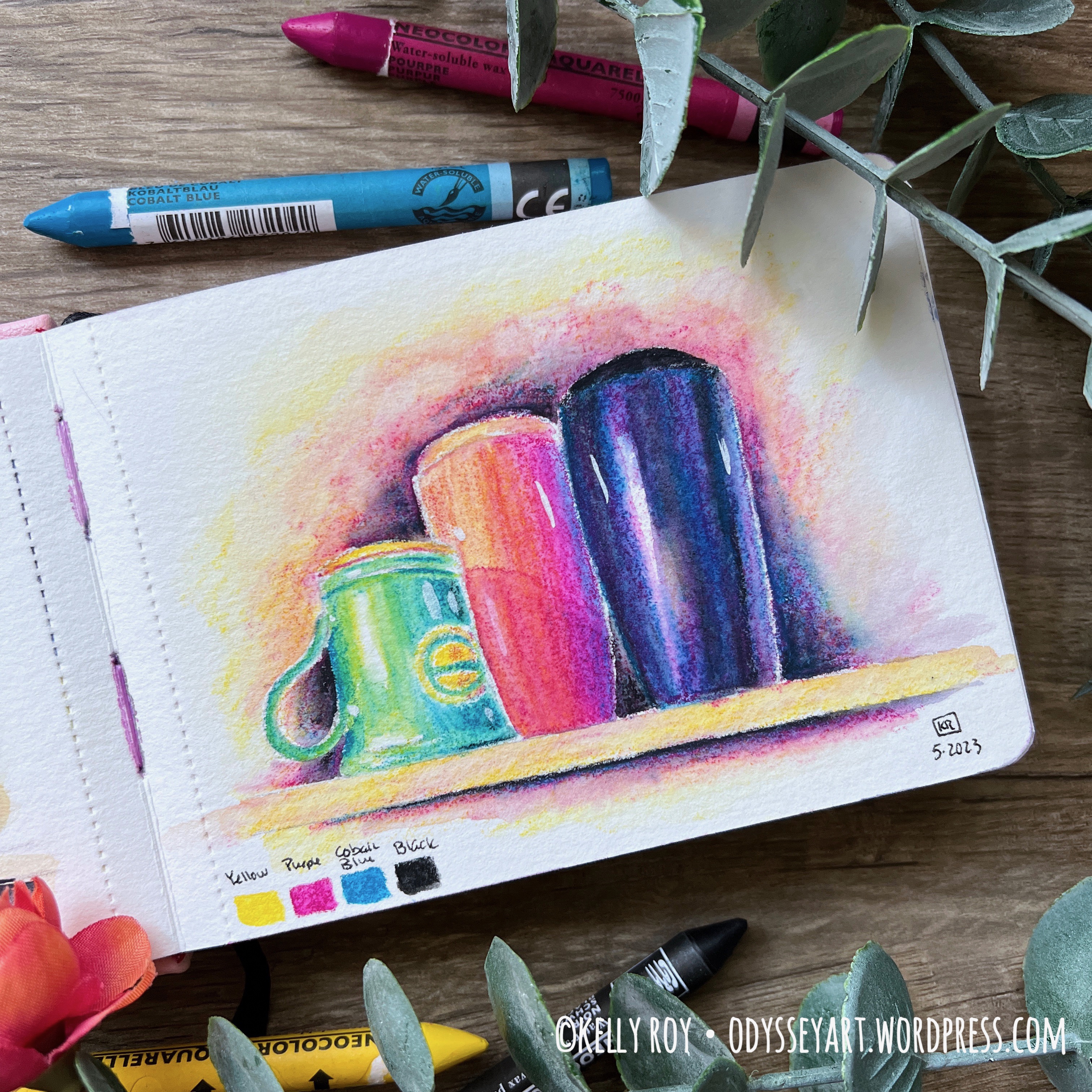
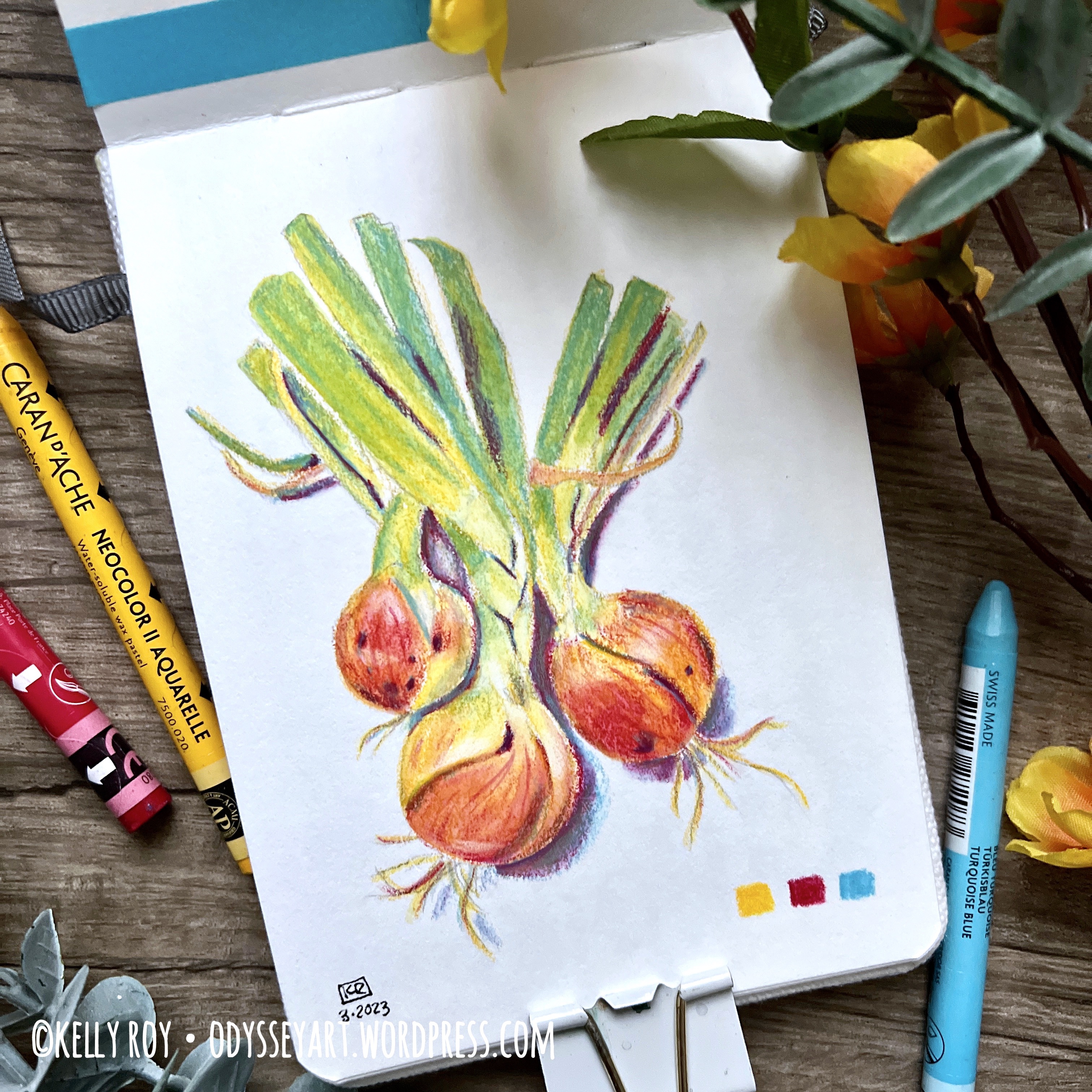
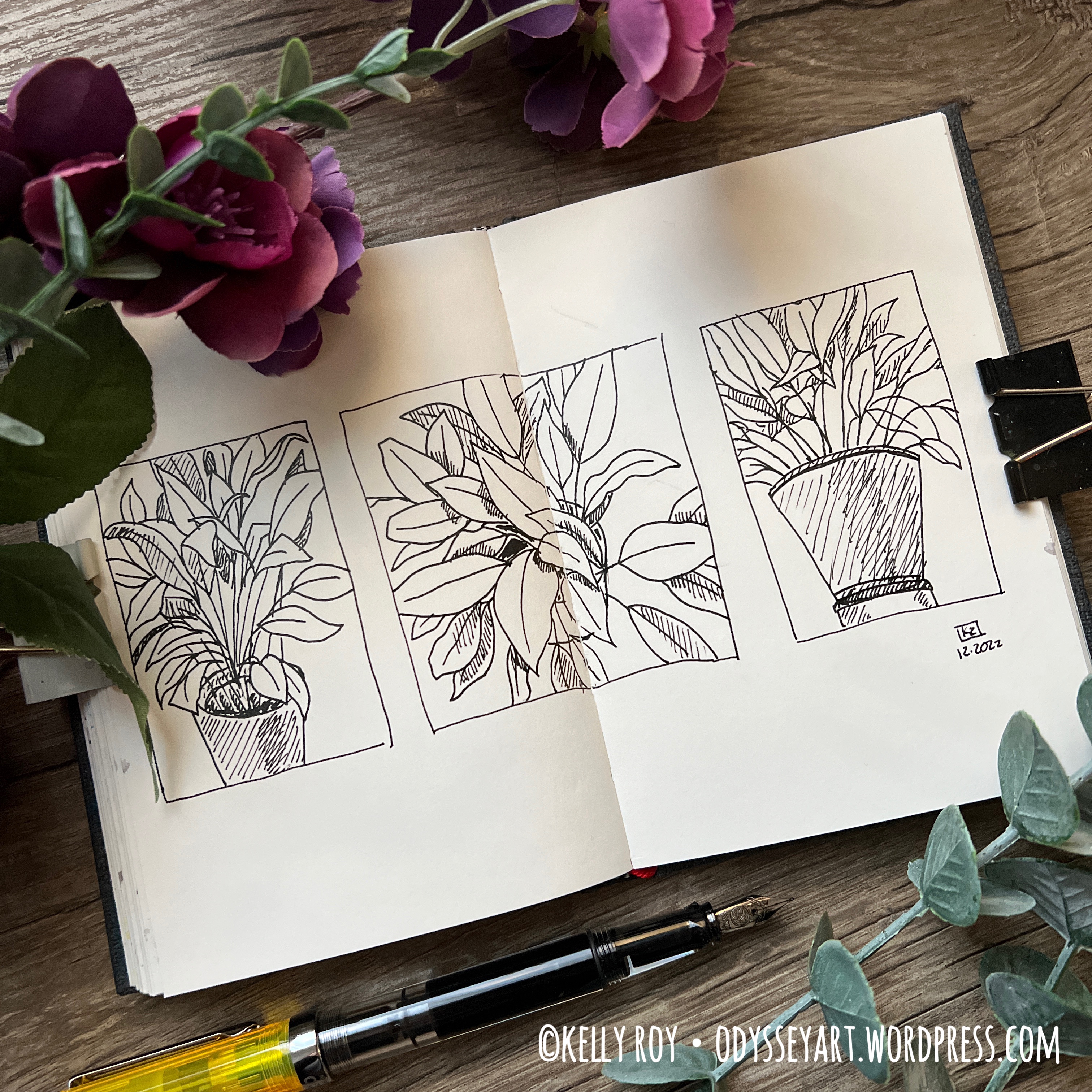
You’ll see I also delved into using my Caran d’Ache Neocolor II water soluble pastels quite a bit. I’m having a lot of fun working with them in a limited palette. I chose to utilize a fun challenge on Instagram called the #foodpaintchallenge in order to hone my skills with the Neocolors and the limited palette. It will also explain the many food illustrations in the sketchbook, although not all of the foods/botanicals were from the challenge. Some I worked from my own photographs. The philodendron illustration at the front of the book (my favorite) was actually from life.
The hot press paper in this sketchbook supported the Neocolors really well. I didn’t get a lot of scratchy “crayon-looking” marks like I did when I tried them in a cold press sketchbook.
When I’d finished filling the sketchbook, I added a little more interest to it throughout by adding little strips of washi tape here and there. I kind of feel like it helped pull it together a little better. And, lastly, I decided I didn’t want to leave just the white cover, which had gotten a bit grungy after a while, so I used my Neocolors to just apply some color there.
For my next travel sketchbook, I’m working in a Baohong 100% cotton hot press sketchbook. I was eager to try them out after coming across a review raving about how good Baohong paper is. I did some searching and found they had sketchbooks available, so I decided to grab a hot press version and give it a go. I’m enjoying it so far. Definitely expect a review in the future!
For cold press watercolor sketchbooks, I’m still working in my A5 Etchr Perfect Sketchbook and my Koval Sketchilla Sketchbook.
That’s enough from me. Get cozy this March day and enjoy the flip-through below. I’ve also included some photos of some of my favorite pieces from this sketchbook below the video embed.
And remember, if you see any paintings you like, check my Redbubble shop as I’ve been uploading prints from this sketchbook there for sale.
Some of my favorite artworks from this sketchbook:


Be sure to follow my Instagram account @kellyro77 to stay up-to-date on my creative endeavors.
Contains affiliate links. See disclosure for more info.
Etchr A6 100% Cotton Watercolor Sketchbook, Hot Press
Caran d’Ache Museum Aquarelle Watercolor Pencils
Caran d’Ache Neocolor II water soluble pastels
Schmincke Horadam Aquarelle Watercolors
QoR Watercolors
Faber-Castell Pitt Artist Pens
Pentel Aquash Water Brushes
Platinum Carbon Ink
TWSBI Eco Fountain Pen
Washi Tape
Binder Clips
As an Amazon Associate I earn from qualifying purchases. A list of materials can be found at the end of this post. As usual, please note that any links to Amazon products within this post are affiliate links, meaning I make a minute commission should you choose to purchase something via the link. This is at no additional cost to you. That said, I appreciate your patronage by using the links to purchase products. While small, any amount of money helps me to keep making art and sharing it with the world.
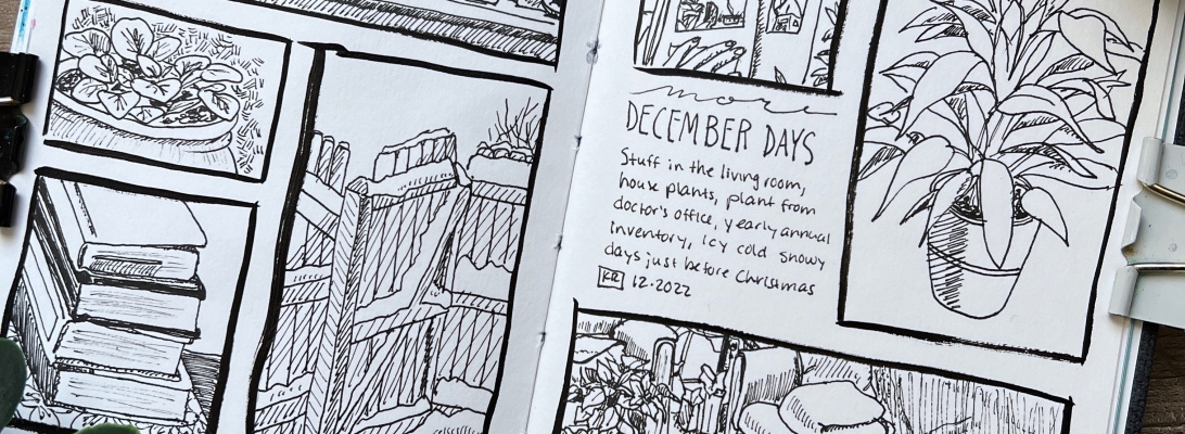
Finishing off 2022 with a bang! Okay, not a bang. It’s just another sketchbook, but holy cow it’s the seventh one of the year!
Honestly, I found myself kind of struggling through this one. A few things came into play where that’s concerned. First was just not feeling fully inspired by much around me. Winter just tends to be a time of little creativity for me. I purposely pushed myself through this sketchbook, however, because I didn’t want to have one day of no creating turn into a week and then into a month and then before I know it, it’s been another six month dry-spell for me. Not interested in experiencing that again.
Second, I had some stress going on in my life that left me feeling pretty uncertain about some things, and when I’m stressed, I really don’t want to do anything creative. Again, I pushed through the stress and drew anyway, but again, it was difficult to feel inspired.
Finally, I just didn’t enjoy this sketchbook as much as I did the Arteza one. The paper in this is just a bit weird and not to my liking. I shared a full review of this Hahnemühle Nostalgie sketchbook the other day, so if you want more details, head over and check it out.
As with my previous sketchbook, I used several different mediums in this one and jumped all over the place as far as subject matter goes. A lot of observational drawing with fountain pen, still, as well as some abstracts, and working from a couple of photographs.
Towards the end of the sketchbook, I’d found a small set of Caran d’Ache Neocolor II water-soluble pastels and you’ll see I played with those quite a bit.
In January, I do plan to give myself a little bit of breathing room. I have a commission I need to finish, but mostly I don’t want to feel encumbered by Instagram’s algorithms and pressured to post something new every single day. I’ve solved that issue by going back through all my many, many sketchbooks over the past seven years or so and will be posting throwback artworks for the month while I get caught up and allow myself to be more curious and playful with my daily drawing habit. I might just allow myself to take a couple days to finish a piece of art!
So, that said, it might be a bit of a longer stretch until my next sketchbook flip.
For my next travel sketchbook, I’m going to be working in an A6 landscape-format Etchr 100% cotton hot press sketchbook. After working in a few different sketchbooks these last few months, I think, ultimately, my paper of choice will be 100% cotton hot press. Yes, even after I gushed about the Arteza sketchbook, I still prefer 100% cotton paper.
For cold press watercolor sketchbooks, I’m still working in my A5 Etchr Perfect Sketchbook and my Koval Sketchilla Sketchbook.
That’s enough from me. Get cozy with something warm to drink and enjoy the flip-through below. I’ve also included some photos of some of my favorite pieces from this sketchbook below the video embed.
Remember, if you see any artwork you like, check my Redbubble shop as I’ve been uploading prints from this sketchbook there for sale.
Some of my favorite artworks from this sketchbook:


Be sure to follow my Instagram account @kellyro77 to stay up-to-date on my creative endeavors.
Contains affiliate links. See disclosure for more info.
Hahnemühle Nostalgie A6 sketchbook
Platinum Carbon Ink
Noodler’s Heart of Darkness Ink
Noodler’s Blue Nosed Bear Ink
QoR Watercolors
Prismacolor Colored Pencils
Caran d’Ache Neocolor II water soluble pastels
Caran d’Ache Museum Aquarelle watercolor colored pencils
Pilot Metropolitan Fountain Pen
TWSBI Eco Fountain Pen
Lamy Safari Fountain Pen
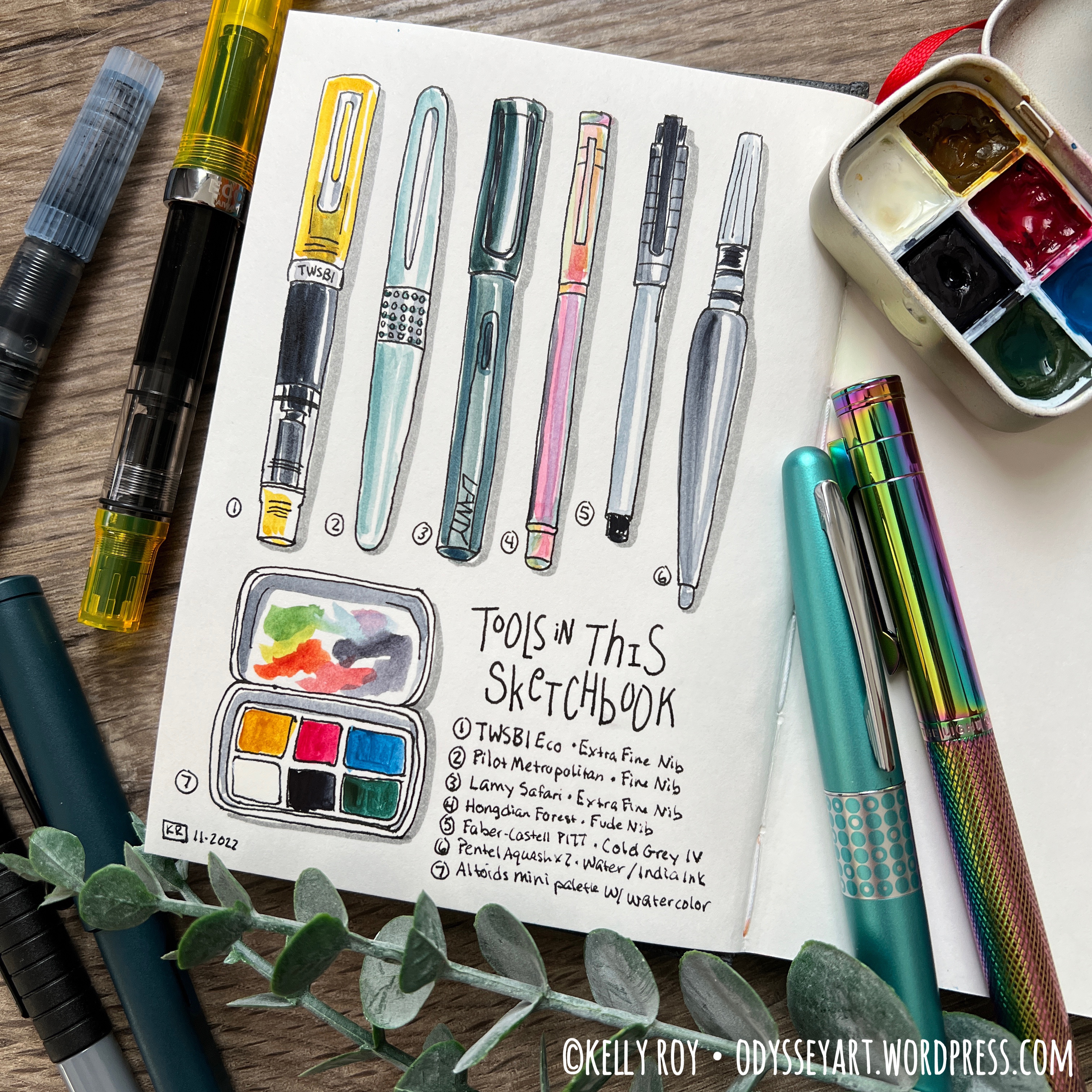
Hongdian Forest Bent Nib Fountain Pen
