 I think it’s becoming clear to me that August just isn’t going to be the month where I get a vast number of entries into my art journal. And that’s quite okay as I’ve been flexing my creative muscles in other ways, such as making a coptic stitch journal, etc.
I actually had a specific plan in mind for this layout, so it was easy to actually complete it when I put the time in for it. I knew I wanted to paint a crane. I prepped the background with some Tim Holtz postage tissue paper and painted over that with a smearing of white and parchment-colored acrylic paint.
My initial goal was to have the crane on a beige-scrap paper type of background, when I painted the bird on the page, it seemed to get lost on the page so I filled in the background with the black paint.
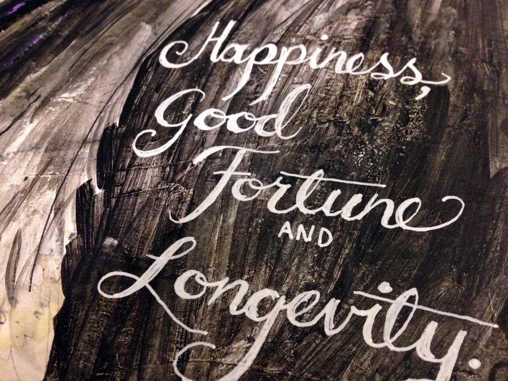
The layout left a large black gap on the lower right of the page so I looked up what the crane symbolizes in asian culture and wrote down those words in mock calligraphy with my white Uni-ball Signo pen. I filled the upper left corner with a prayer I found online given to cranes.
 Not my best layout but what I am happy about is that my crane looks like a crane. And I really love the bright orange of its eyes. I referenced a Demoiselle crane for this painting and that is the typical color of their eyes. I added a little interest on the color scale, as well, with a few quick strokes of violet paint along its neck.
Hope you enjoyed the layout. Leave a comment below or like the page and share with your friends. :) Thanks for reading!
List of materials:
Canson Mixed Media sketchbook
Mod Podge
Golden Soft Gel (Matte)
Tim Holtz postage tissue paper
Artist’s Loft Acrylics
Sharpie Pen
Uni-ball Signo pen
